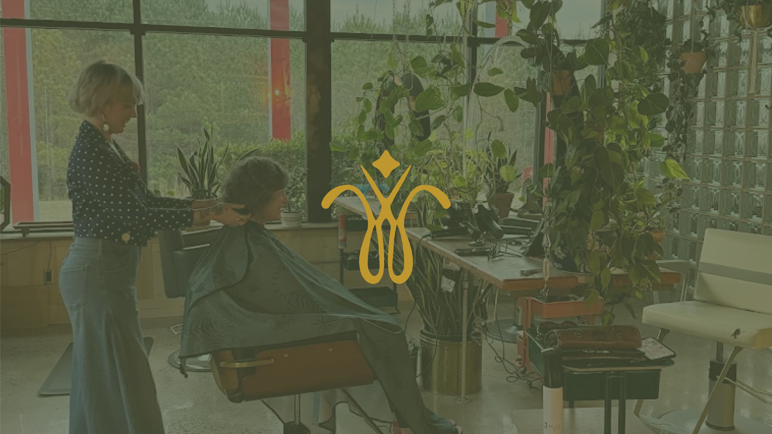
While at Calor Creative, I pitched a concept for brand identity for Wisp the Salon in Athens, GA.
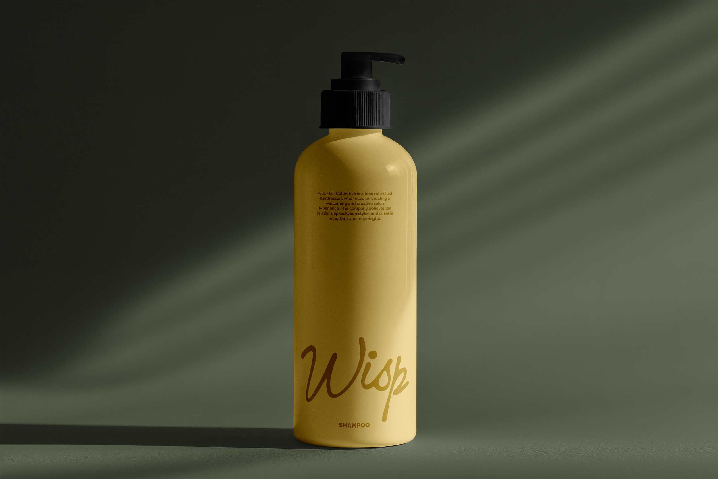
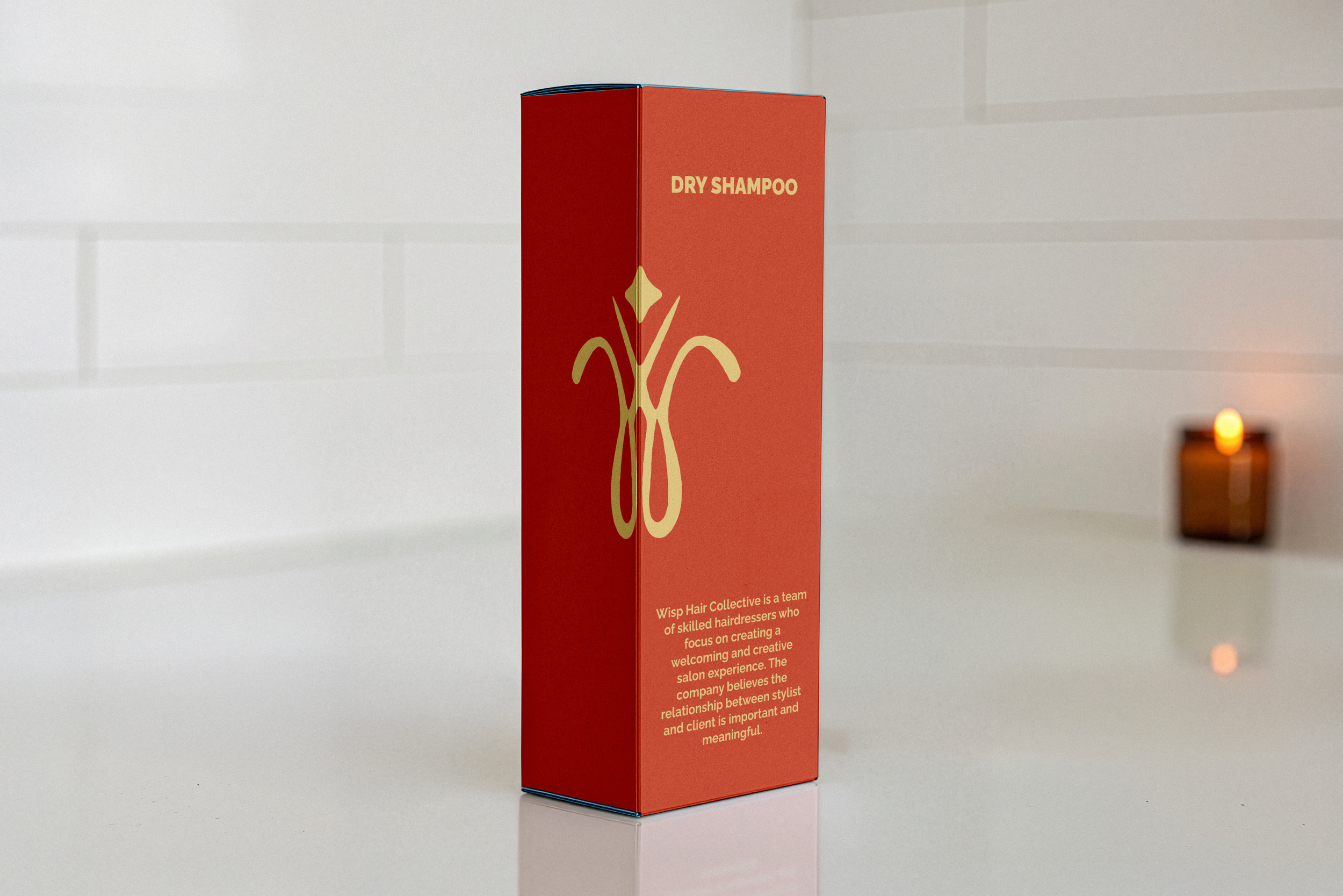
Wisp Hair Collective is a team of skilled hairdressers who focus on creating a welcoming and creative salon experience. The company believes the relationship between stylist and client is important and meaningful. Every part of the space is designed to support that connection and make clients feel comfortable, inspired, and cared for.
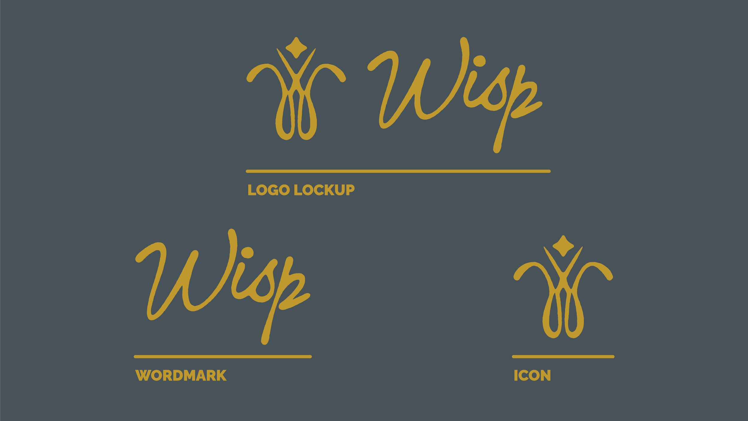
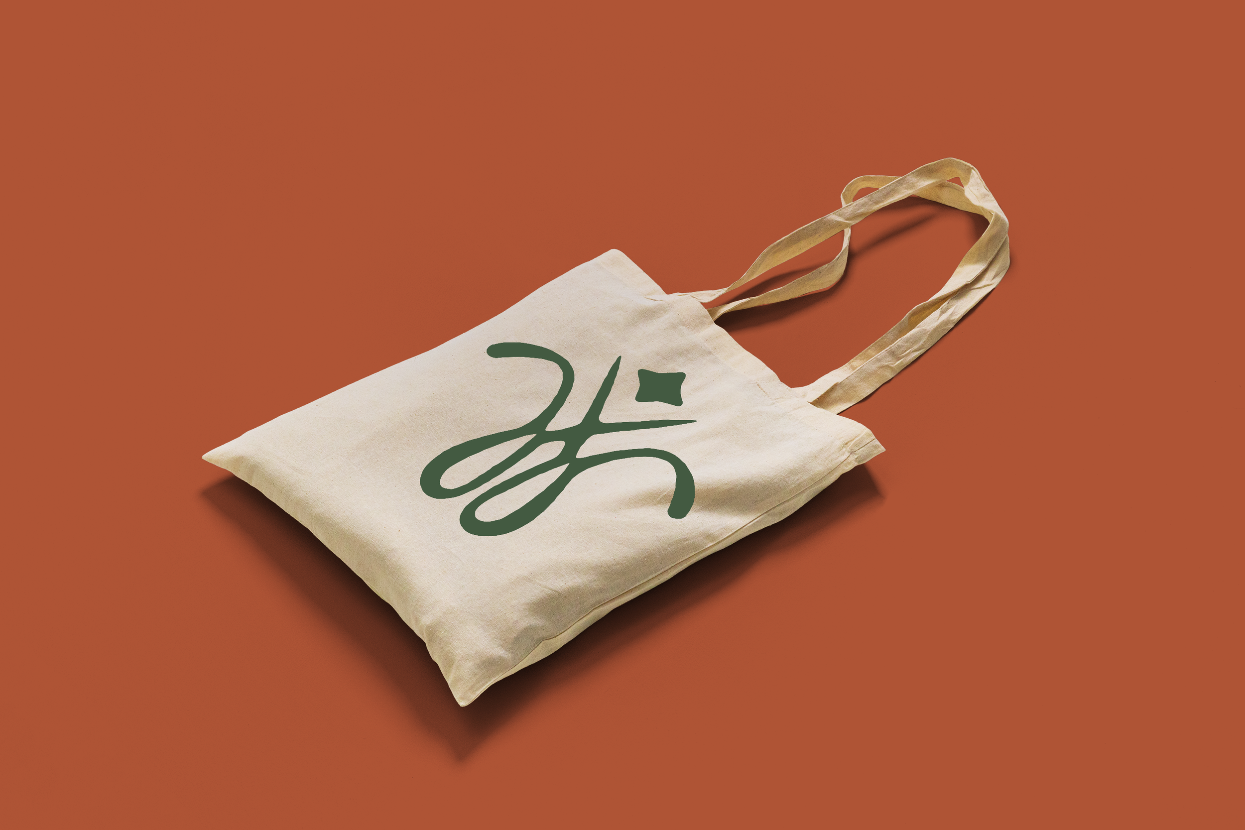
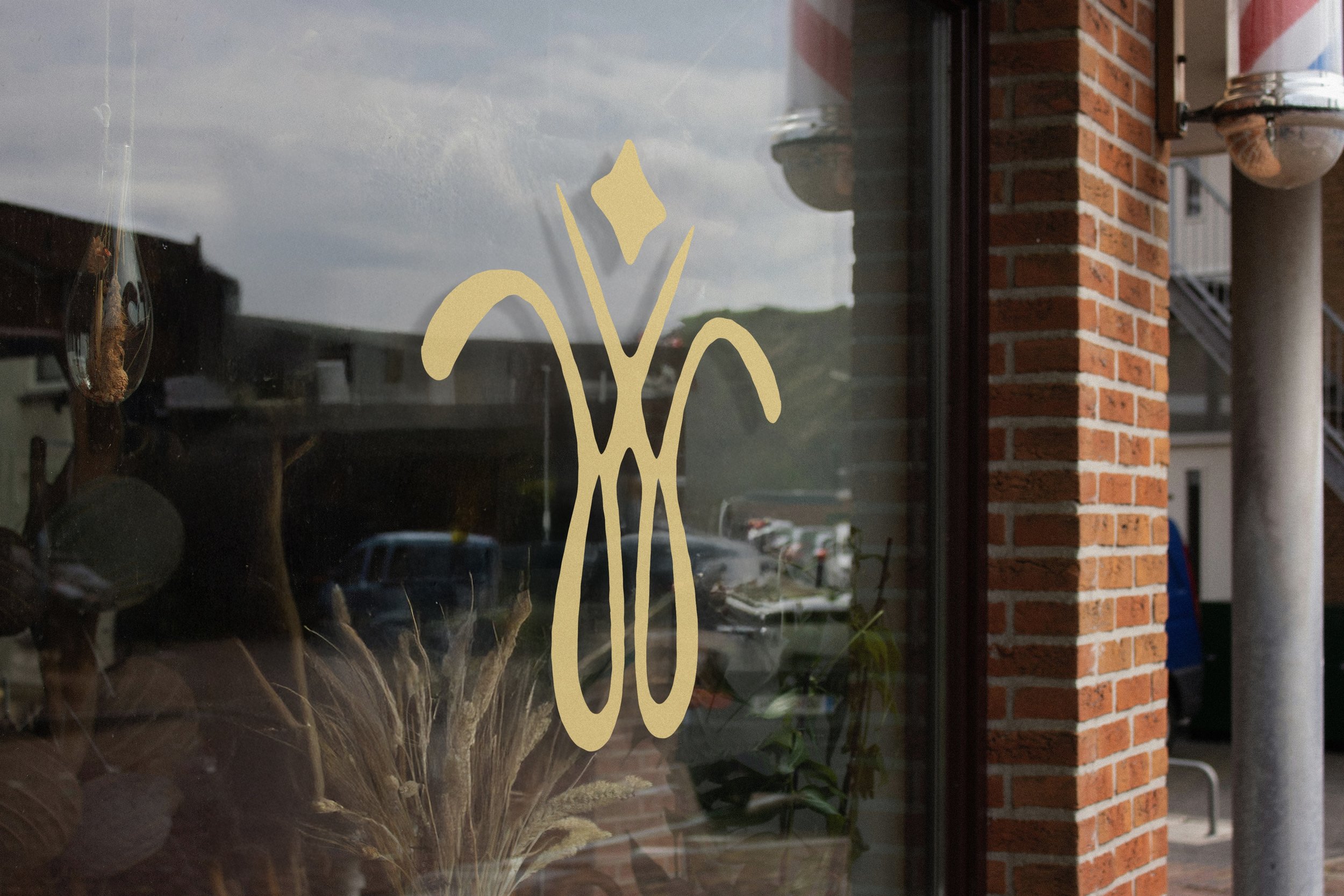
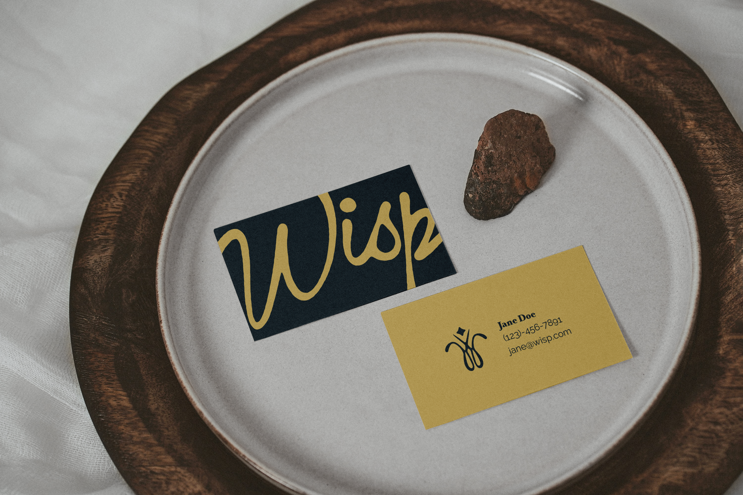
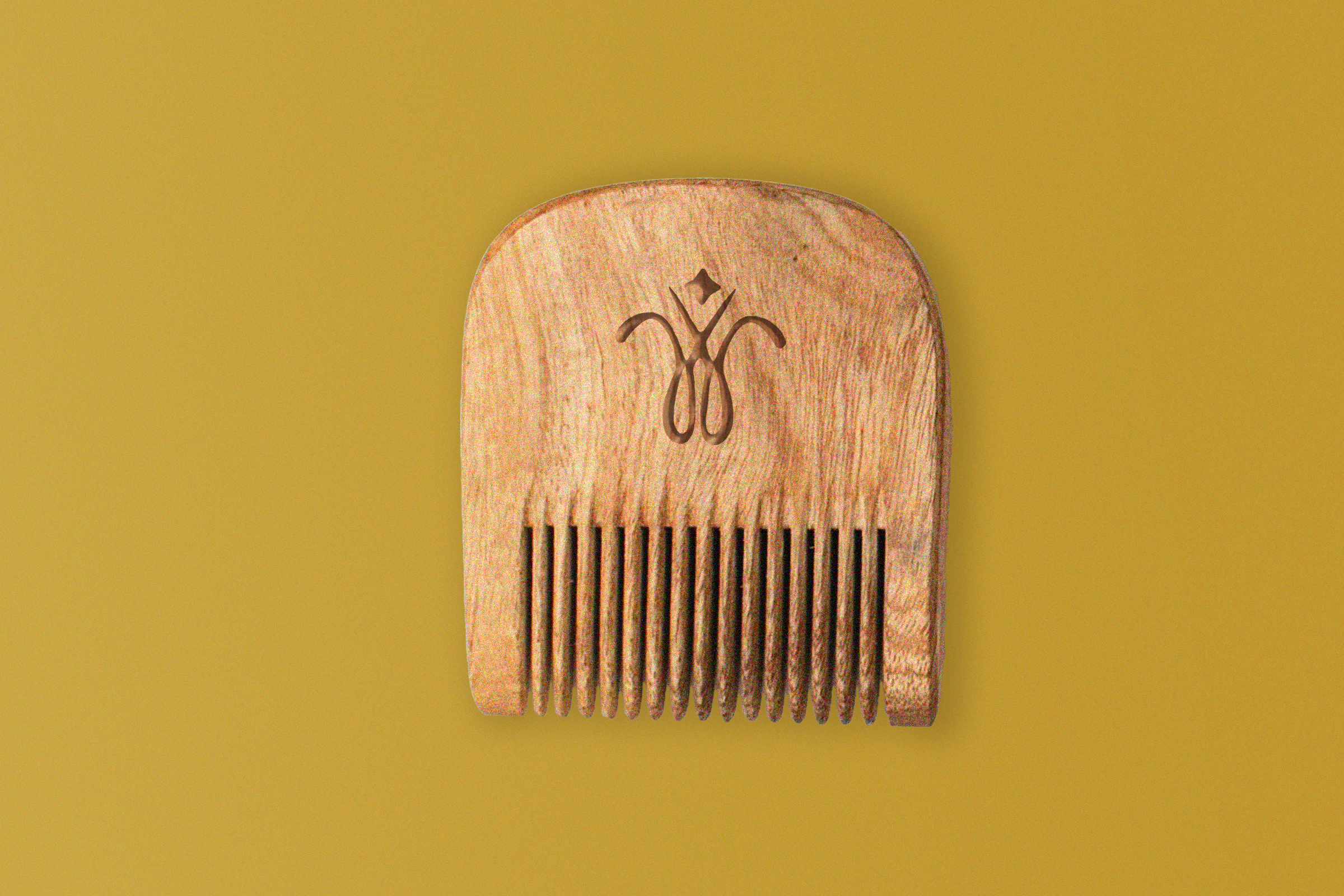
The logo features a flowing W combined with a pair of scissors in a smooth Art Nouveau inspired style similar to the work of Alphonse Mucha. The wordmark is written in a soft script to give it a handcrafted feel. The overall look of the brand is inspired by 1970s fluid artwork, especially illustrations of women and flowing hair, which adds warmth and movement to the design.
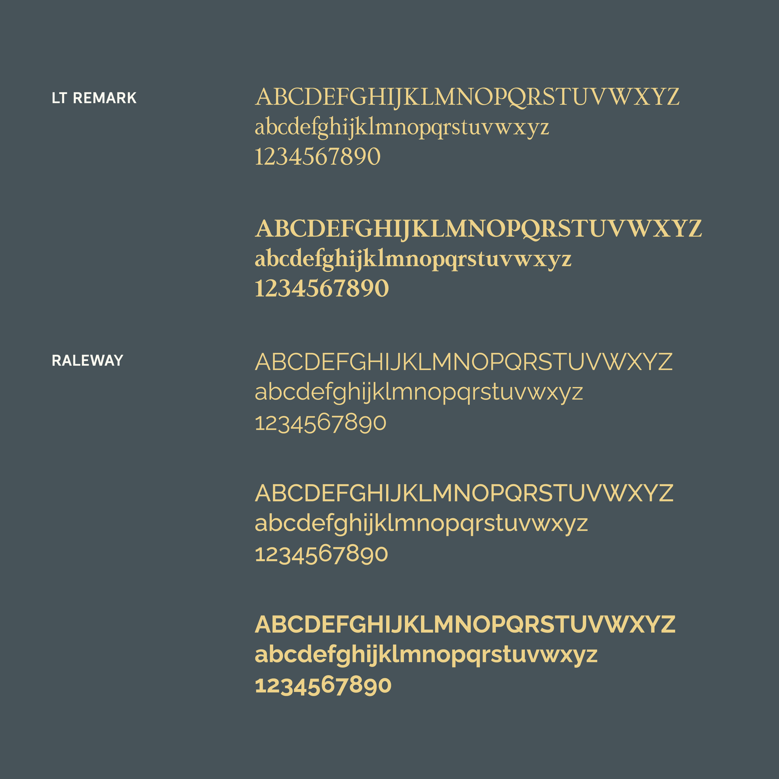
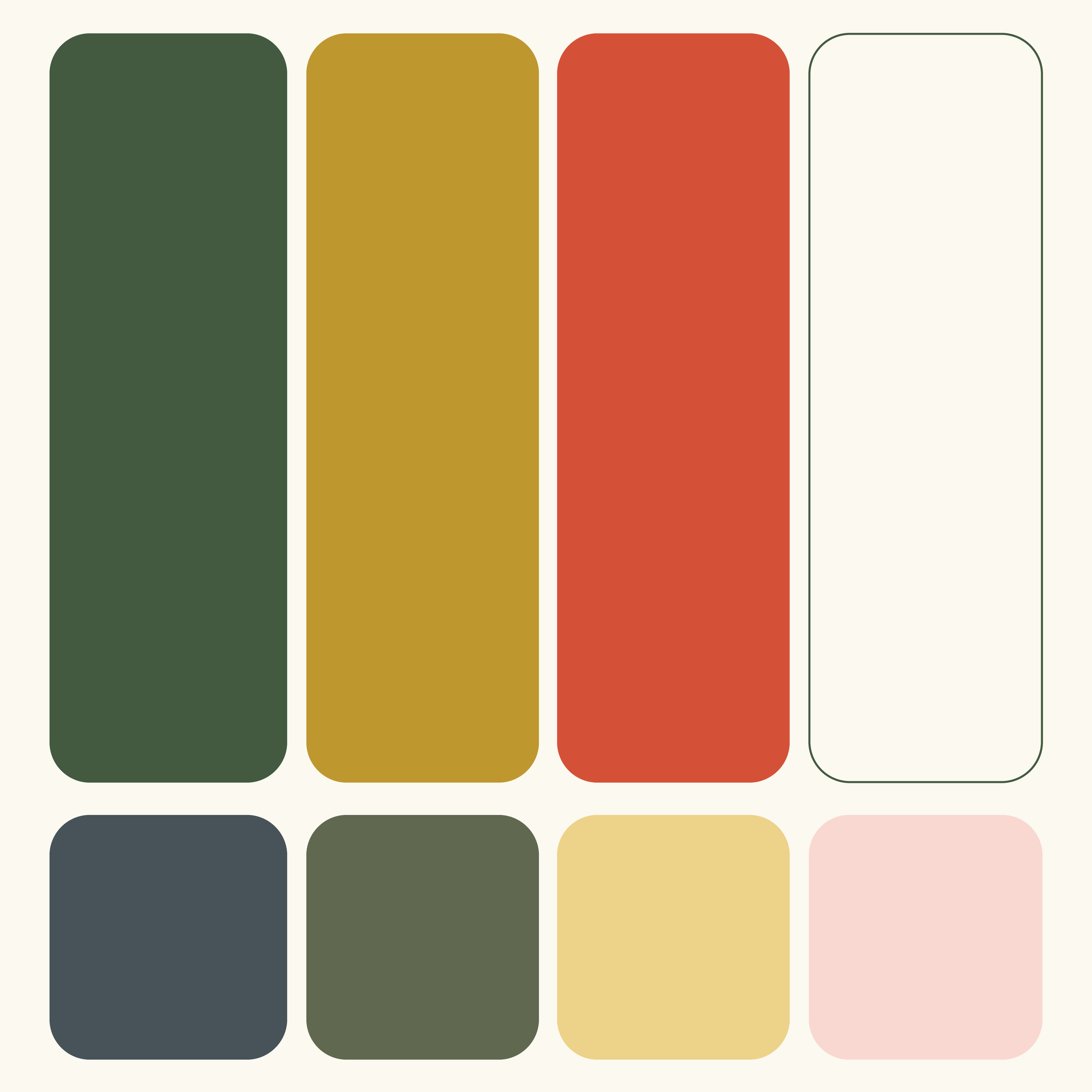
The brand uses dark earth tones as its main colors, including Forrest, Honey, Posy, and White. Secondary colors include Slate, Sage, Daisy, and Blush to add softness and variety. LT Remark is used for headings to create strong impact, while Raleway is used for body text for a clean and modern look.

A short GIF animation was created in Adobe Illustrator and Photoshop to bring the brand to life. The animation shows the scissors opening and closing in a slightly choppy style, then forming the flowing W shape before revealing the full logo lockup at the end. This simple motion highlights the hands on craft and creativity behind Wisp Hair Collective.