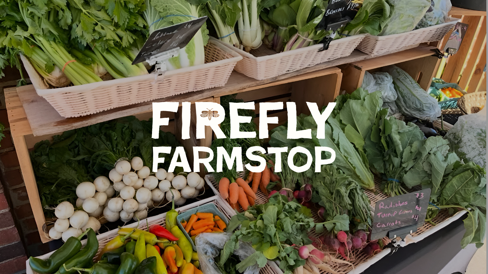
While at Calor Creative, I collaborated in the brand identity for Firefly Farmstop, the newest project of the Marigold Collective in Winterville, GA.
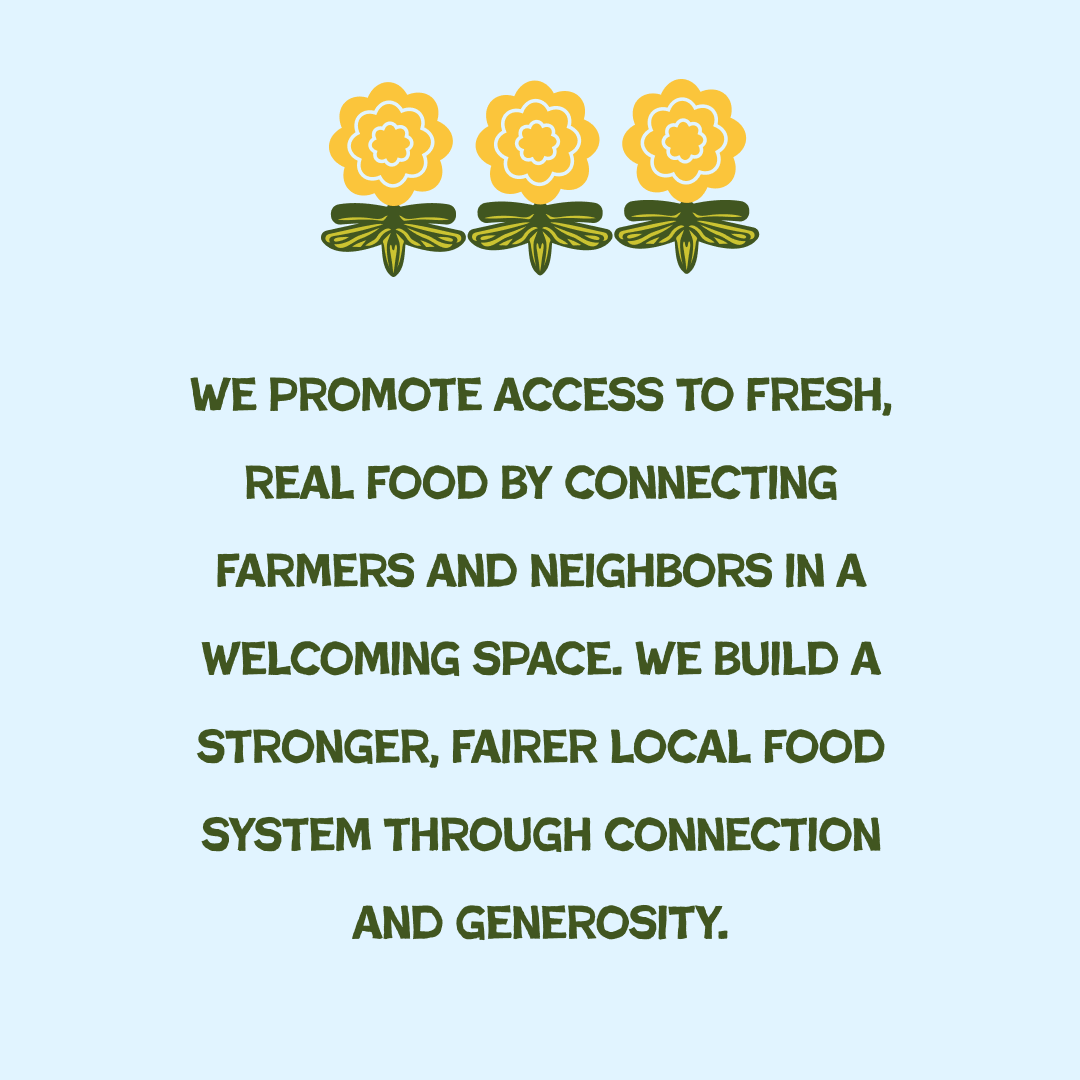
Rooted in the spirit of a farmers market, Firefly Farmstop was created to give local growers and makers a steady, supportive outlet for their work and will serve as an on-the-trail community space along the Firefly Trail. Shelves will be stocked with fresh Georgia-grown produce and handmade goods, offering visitors a place to grab groceries or coffee and connect with neighbors after a walk or bike ride. At its heart, the project led by the Marigold Collective aims to strengthen Winterville’s food system by supporting small producers, increasing access to healthy, affordable food, and keeping local dollars circulating close to home.
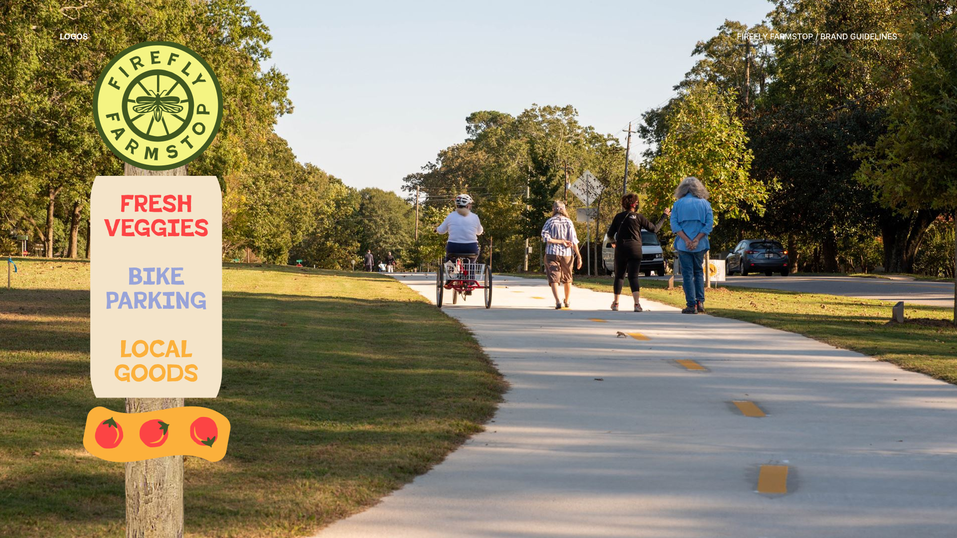
Firefly Farmstop’s brand started with the idea of “bringing our quirk.”
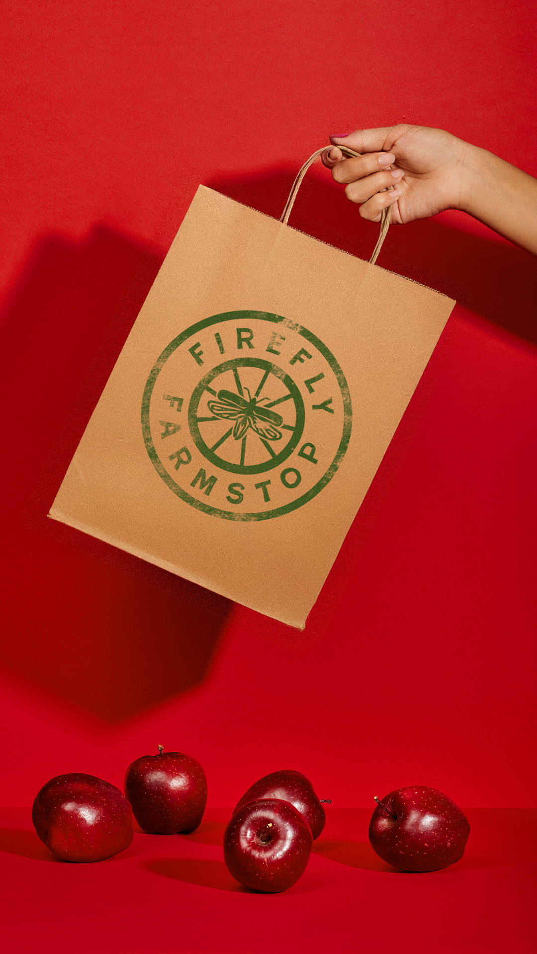
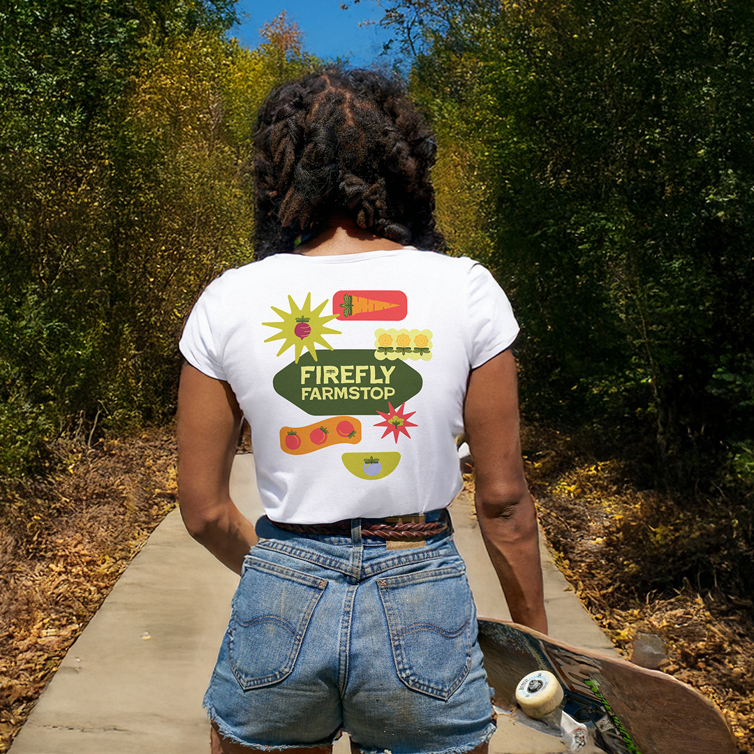
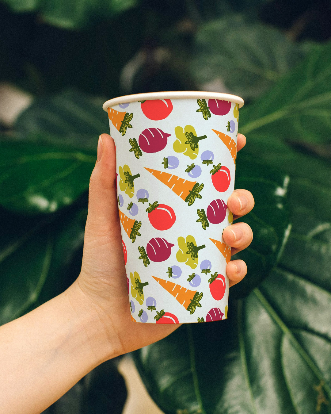
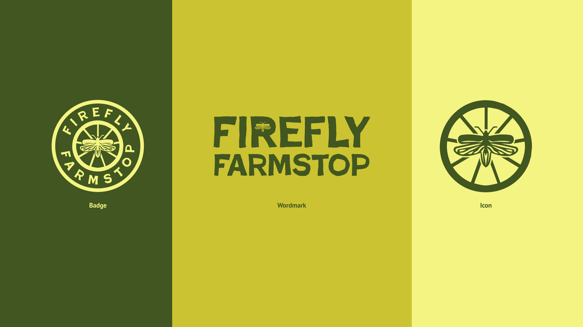
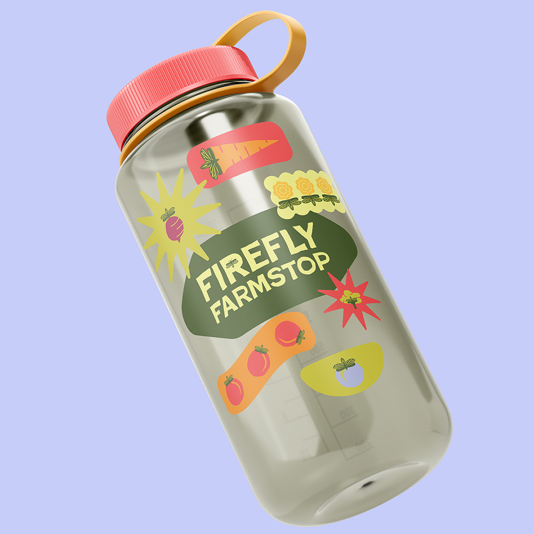
This collaborative project at Calor Creative allowed me to lead the visual concept development, introducing the illustrative fruit and firefly icons that shaped the brand’s grounded, approachable identity. The firefly logo became the centerpiece, with its wing shape inspiring stems, patterns, and supporting illustrations that extended the system across applications. A farmers market–inspired palette of fresh greens and bright produce tones ties everything together, creating a warm, distinctly local brand for the Firefly Trail community.
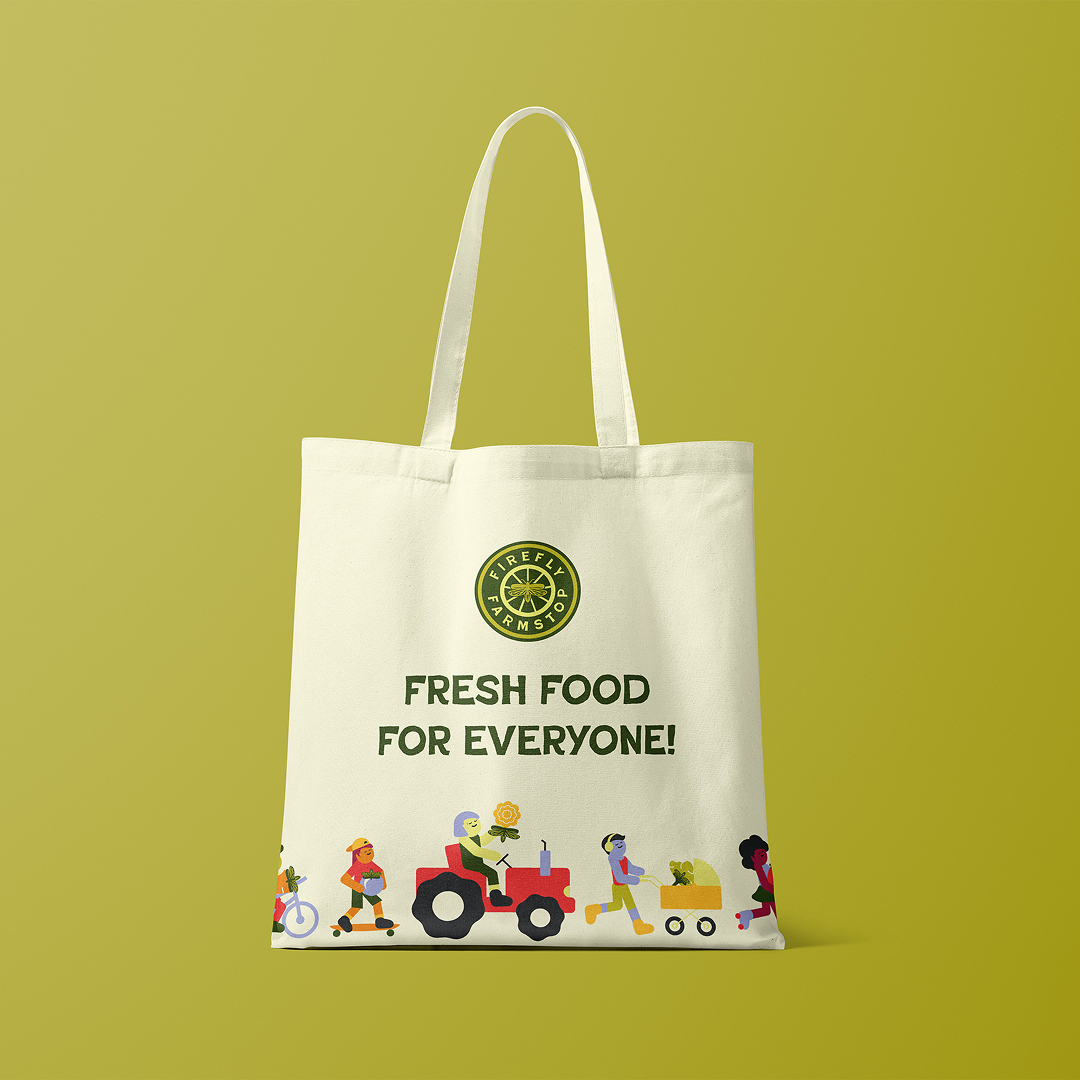
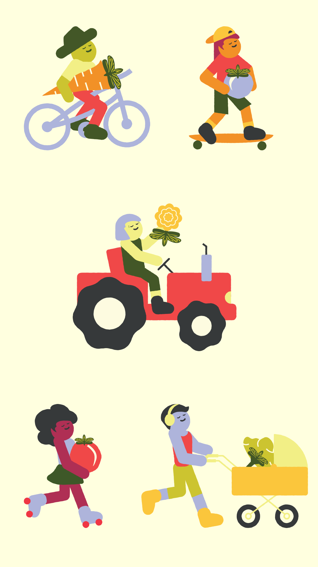
Additionally, a series of simple, character-based graphics was created to represent the people of Athens and Winterville. These figures highlight the diversity of the community and the many ways people can reach Firefly Farmstop, including someone on a bike, roller skates, a skateboard, a tractor, and a stroller. Together, these illustrations emphasize the family-friendly and community-centered nature of the space.
We chose Poster Cut Neue for Firefly Farmstop’s wordmark because of its unique, hand-cut feel that reflects the human touch behind the design. The wordmark also incorporates the illustrated firefly as a closed counter, tying the typography back to the core logo. For body text, we paired it with the open-source font PT Sans to keep materials clear and easy to read across all uses.