I designed a brand identity for a research project, Felt Feelings: a Material Exploration for Sensory Regulation.
For my capstone project, I explored the connection between inclusive sensory experience, mental health, and material design. I created supportive, comforting tools for individuals with anxiety and neurodivergence using fidget-friendly fabrics, interactive garments, and tactile elements. The goal was to blend fashion and psychology to reduce stigma, encourage self-soothing, and promote emotional balance through hands-on, thoughtful design.

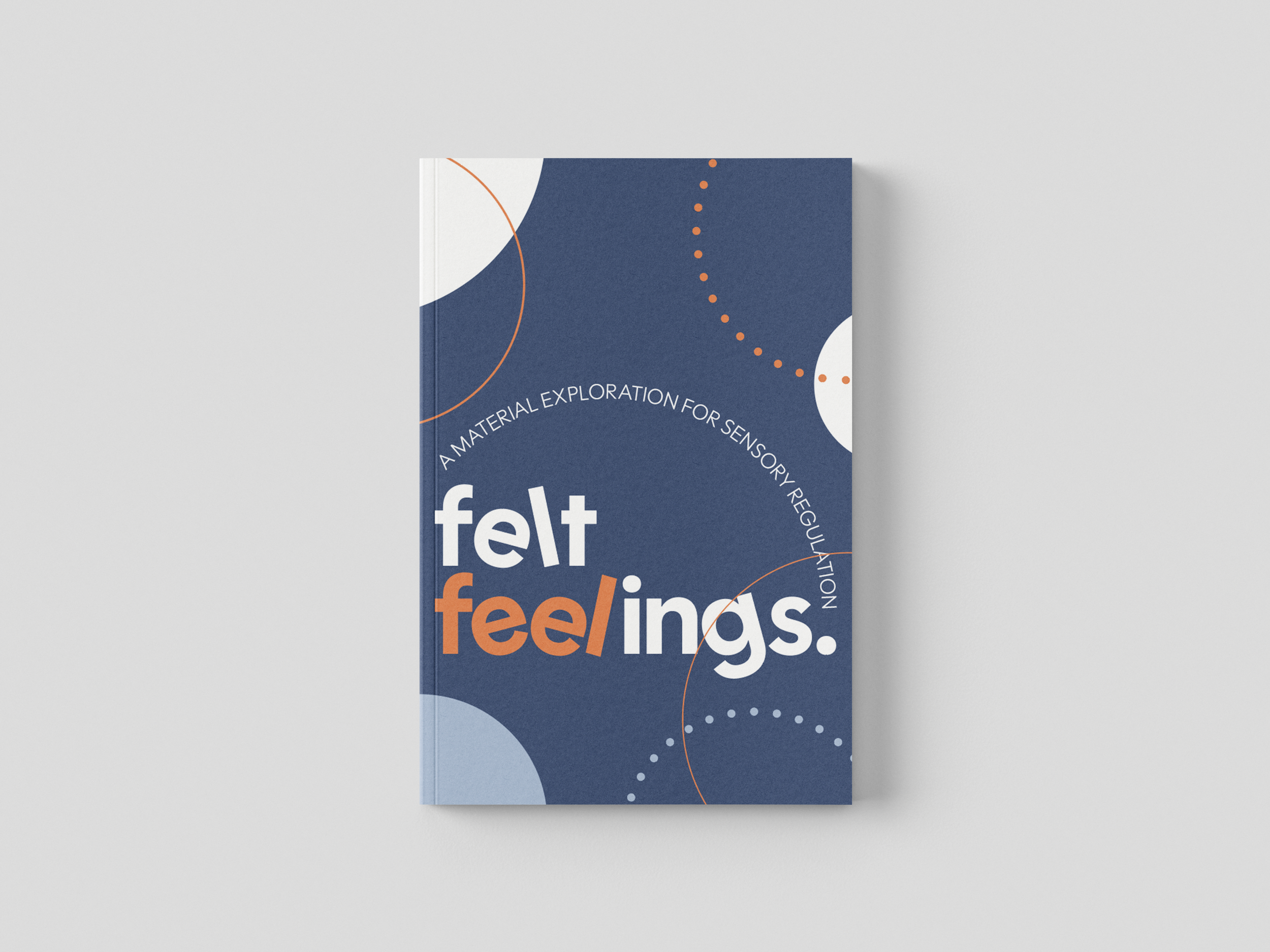
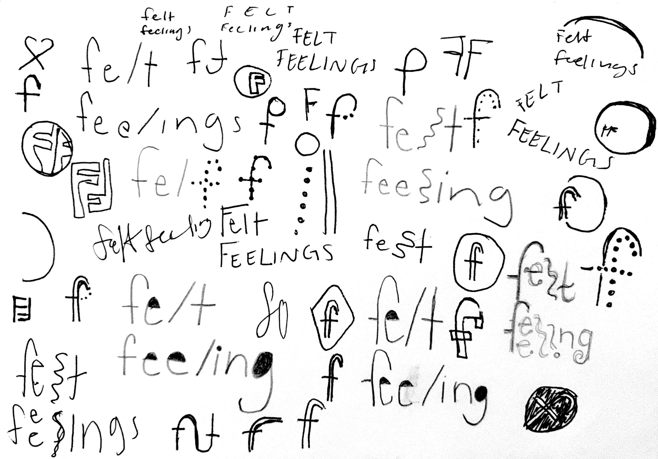
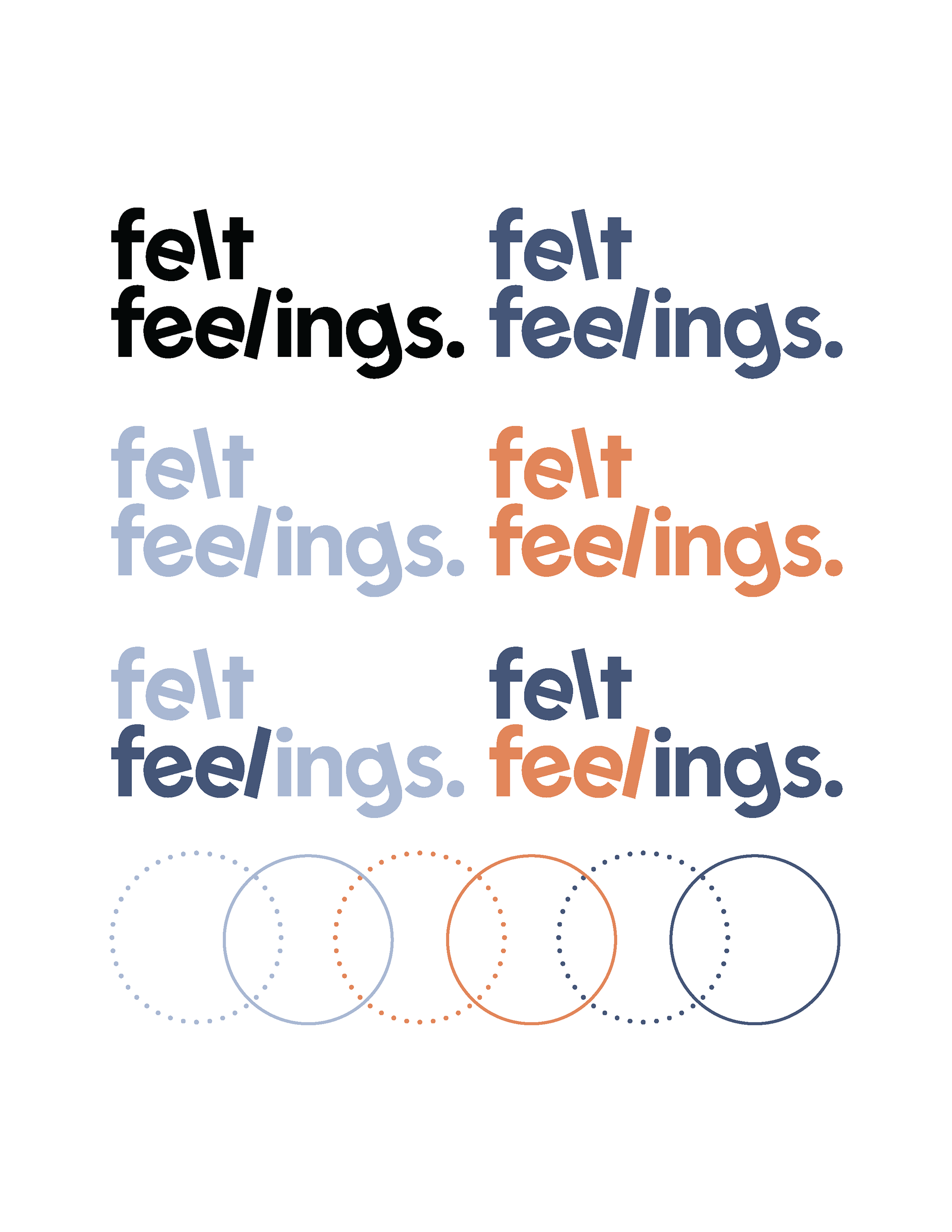
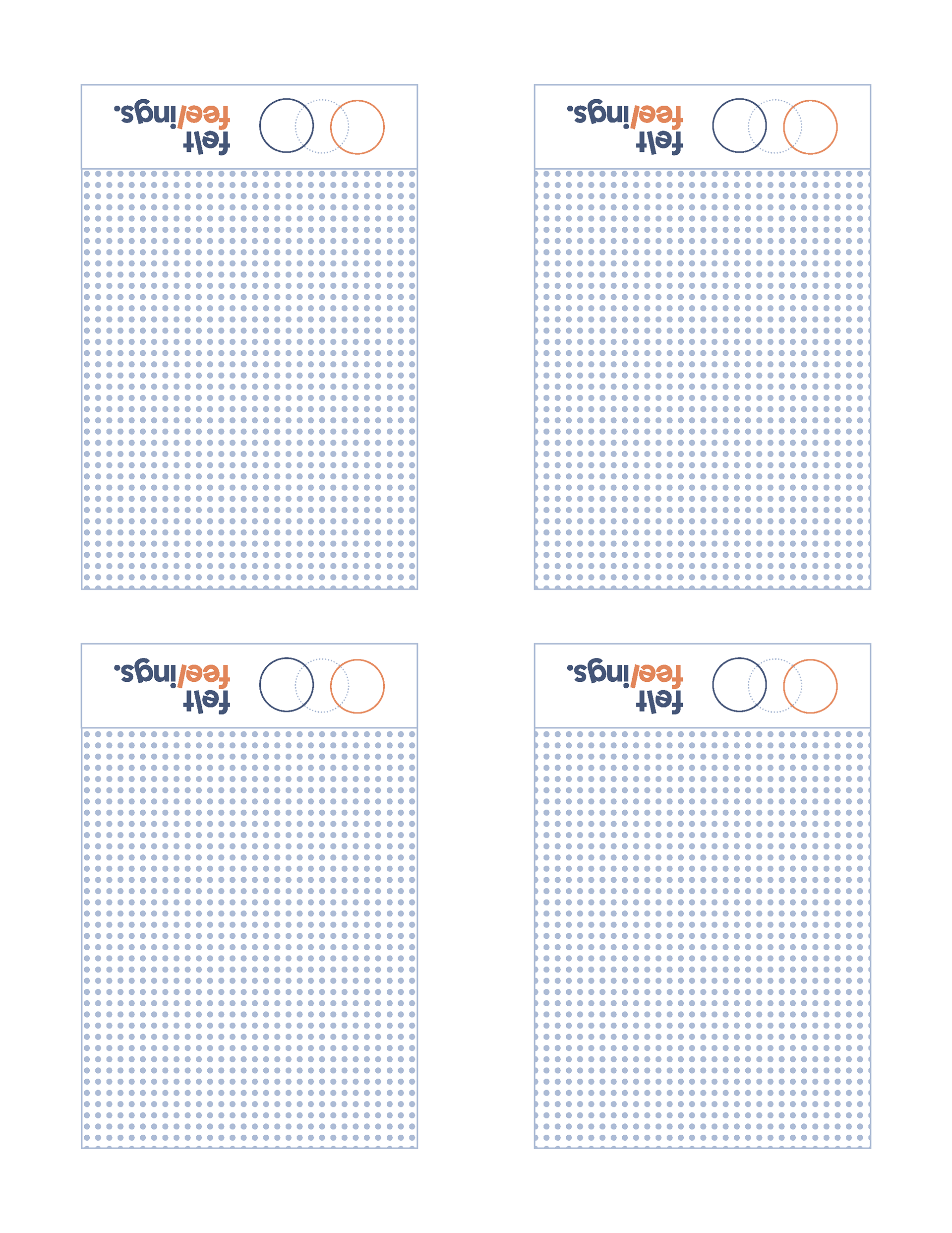
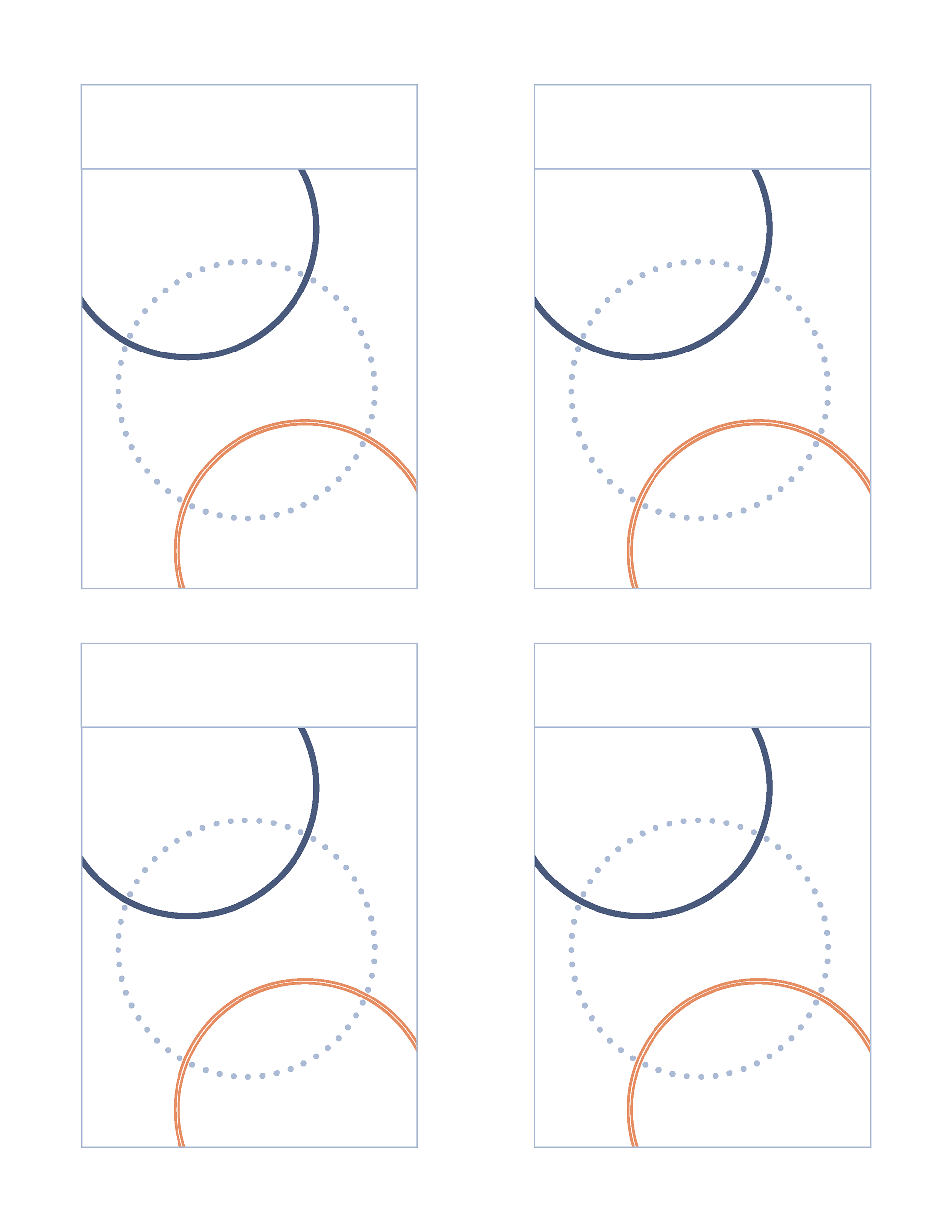
The wordmark utilizes Polymath Bold with 20-degree edits to represent the balance between structure and instability in mental health and fidgeting. Sharp angles and slight distortions in the typography reflect the tension between control and chaos, visually expressing the push and pull between stability and the need for sudden movement or release. The Felt Feelings brand employs Polymath Bold for titles and Freight Macro Pro Book for body text. Polymath’s clean, modern style pairs with Freight Macro Pro’s warm, strong slab serif to create an aesthetically balanced look. This combination ensures boldness in titles while maintaining legibility in body text.
The color scheme of dark blue, light blue, and orange blends calmness with energy; blue (groove) reflects tranquility and stability, aligning with color psychology to evoke a sense of calm, while the contrasting orange (move) introduces an active, playful element that captures the dynamic nature of fidgeting. Together, these elements establish a visual identity that balances calmness and movement, mirroring the duality present in sensory regulation and mental health experiences.


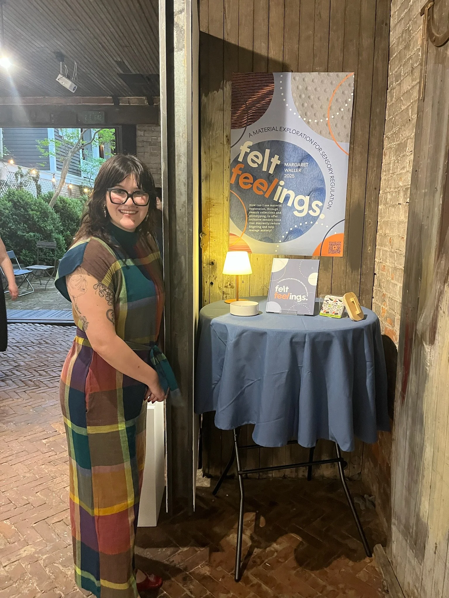
The poster design incorporates circle swatches, a wordmark, branding identity, and a capstone statement, forming a dynamic and visually complex composition. The layered design emphasizes circular motifs, reinforcing the theme of sensory regulation and balance. The interplay of color, typography, and shapes captures the essence of the project while creating an engaging and thought-provoking visual experience that draws attention and conveys the core message in a creative, fidget-friendly manner.
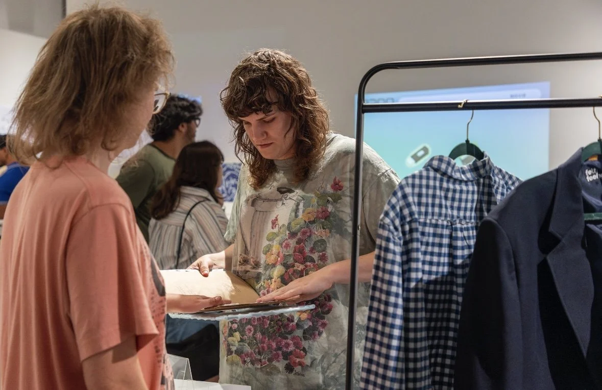
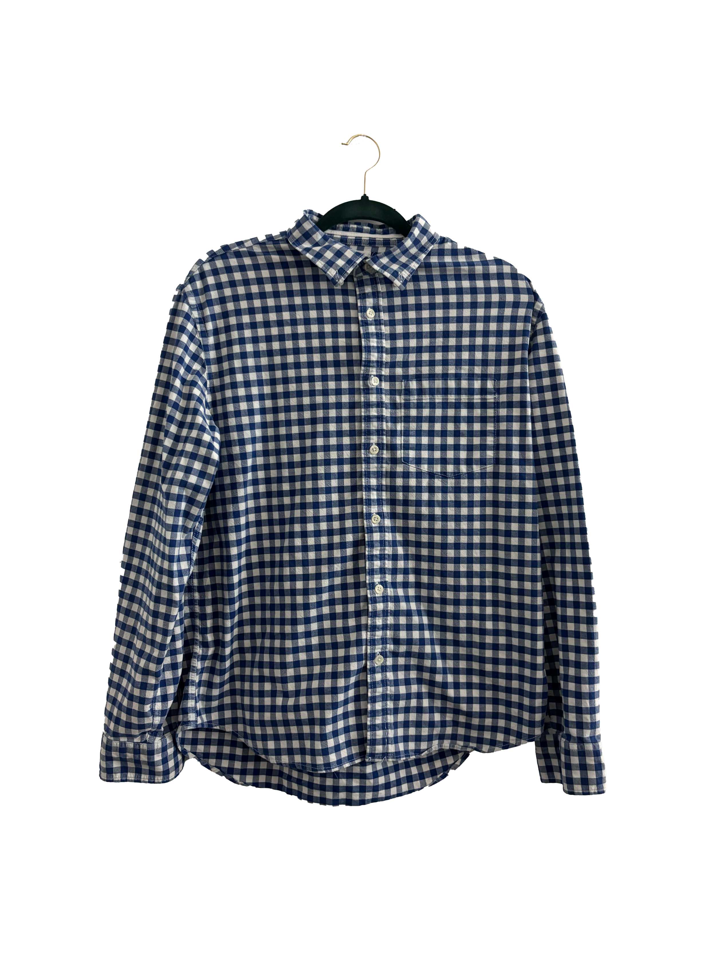
Prototypes consist of clothing items sourced from Goodwill thrift stores, ranging from formal to casual. Store-bought fabrics are modified with embroidery and rhinestones. Hidden pockets and high-touch areas, such as cuffs and thighs, are incorporated for tactile sensory engagement.


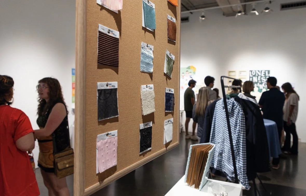
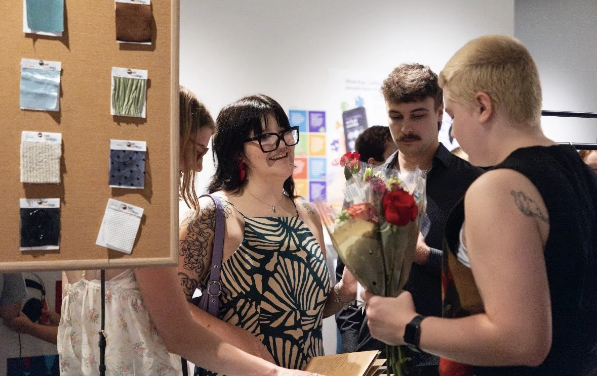
The touch wall will feature industry-standard fabric swatches with modifications, displayed on a corkboard for easy interaction. The fabrics are carefully arranged to allow viewers to touch and feel the textures, providing a tactile experience that is professionally presented. This setup invites direct engagement, allowing visitors to explore the materials’ sensory qualities while maintaining an organized and polished presentation within the exhibit.
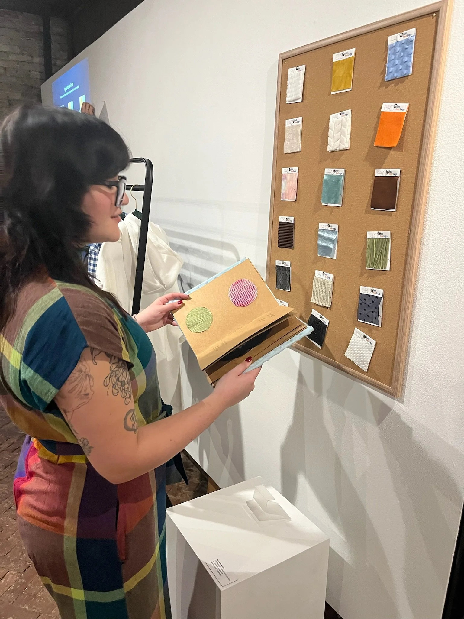
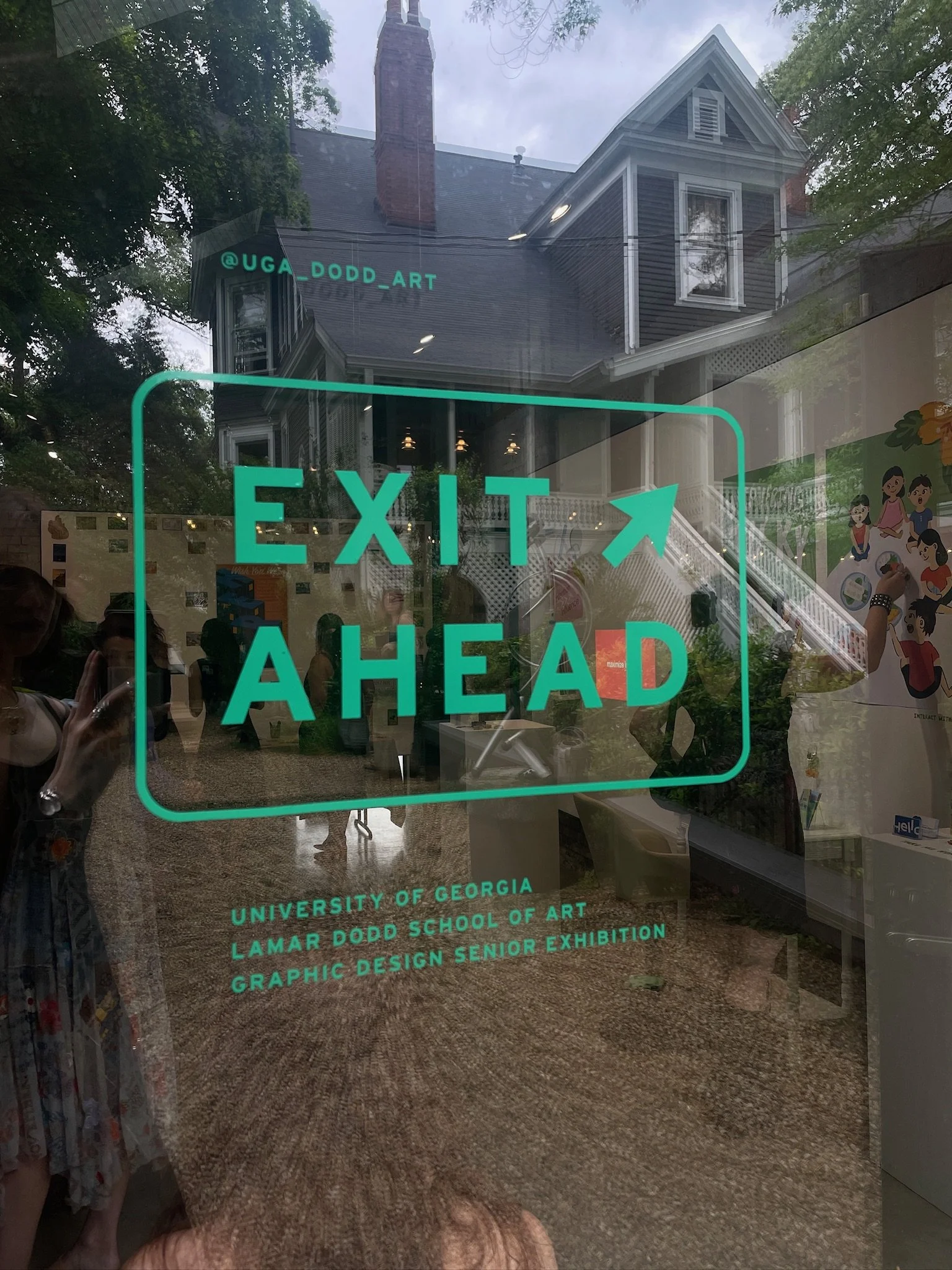
For the Atlanta exhibition, the concept and deliverables were mocked up and sketched. The space showcased the brand system, poster designs, and swatch book. Prototypes featuring fidget-centered fabrics with hidden pockets and high-touch points were displayed, inviting tactile interaction. The layout emphasized the sensory regulation aspect of the project, providing visitors with an opportunity to engage with the materials and experience the calming, emotional impact of the designs in a gallery space.
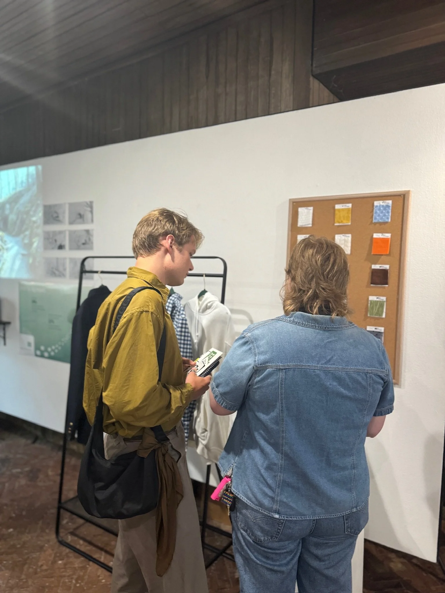
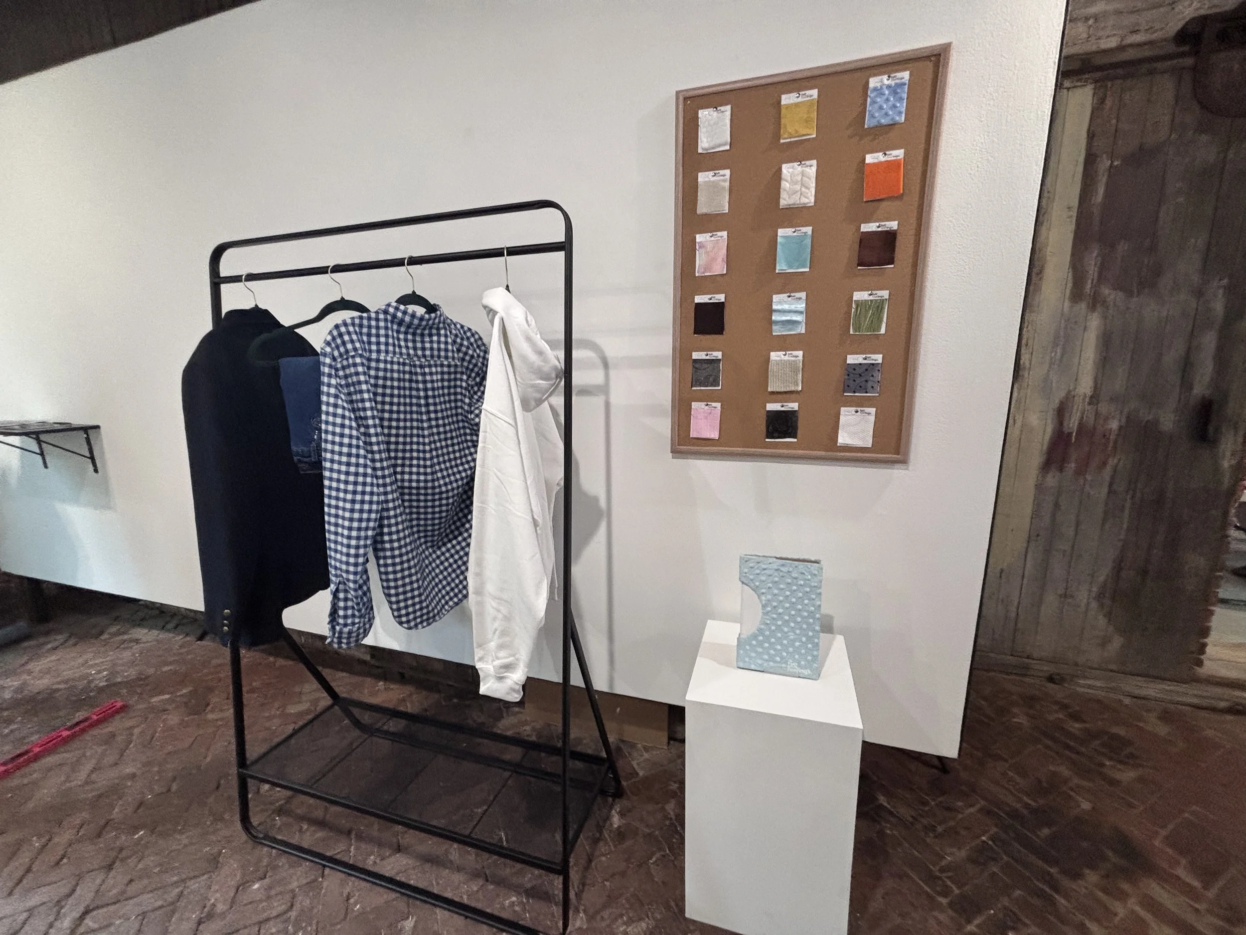
For the Lamar Dodd Exhibition, I mocked up the concept and deliverables for a sensory-focused installation. I hung the poster and touch board together on fishing wire, raising them to eye level for a more immersive experience. Stands were used to display my books, while a clothing rack showcasing the tactile garments became the main draw for the audience. The setup invited physical engagement and highlighted the therapeutic potential of texture, movement, and material in design.