While at Calor Creative, I collaborated in the Rebrand for Athen’s Pride and Queer Collective & a full web project.
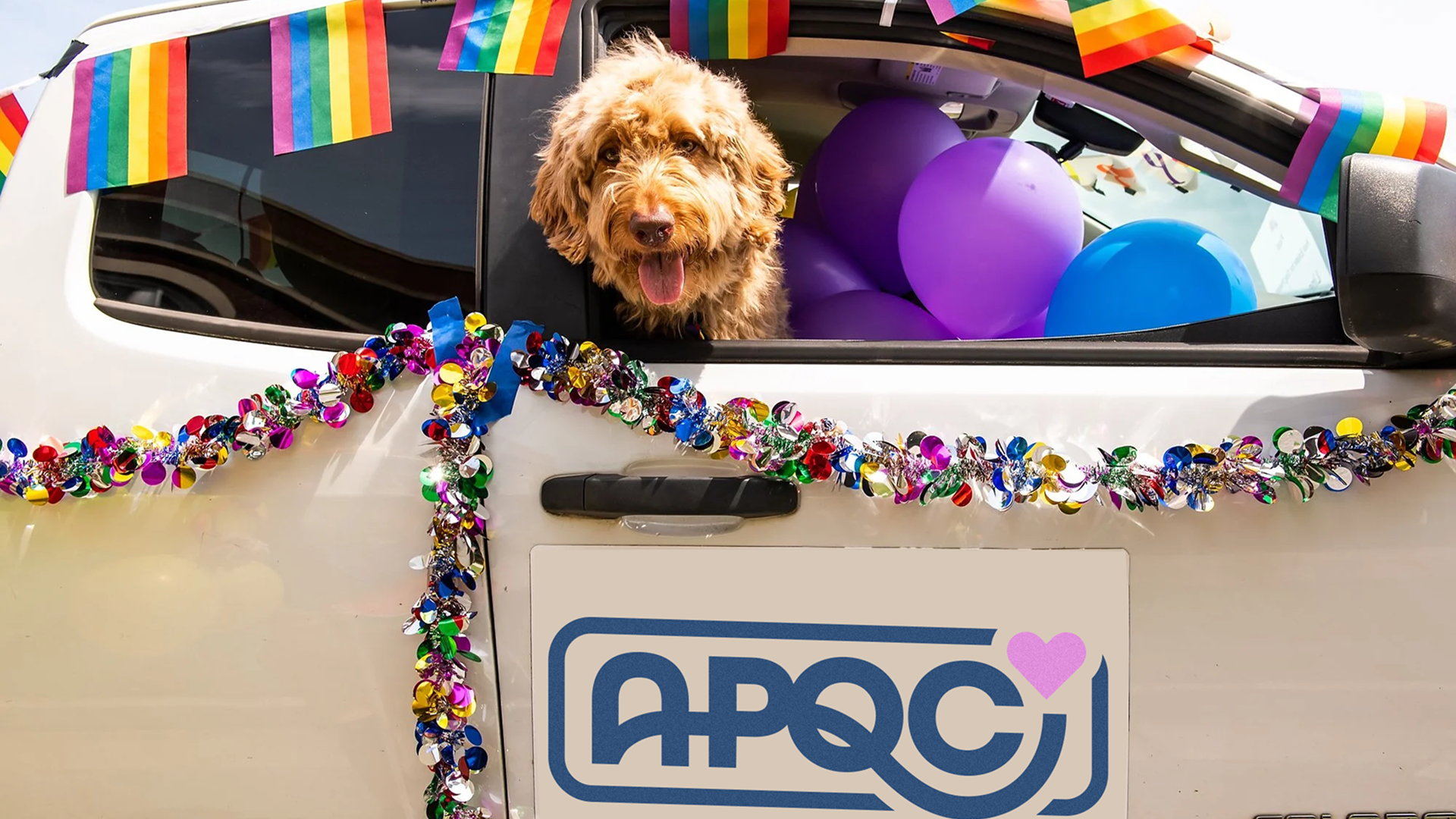
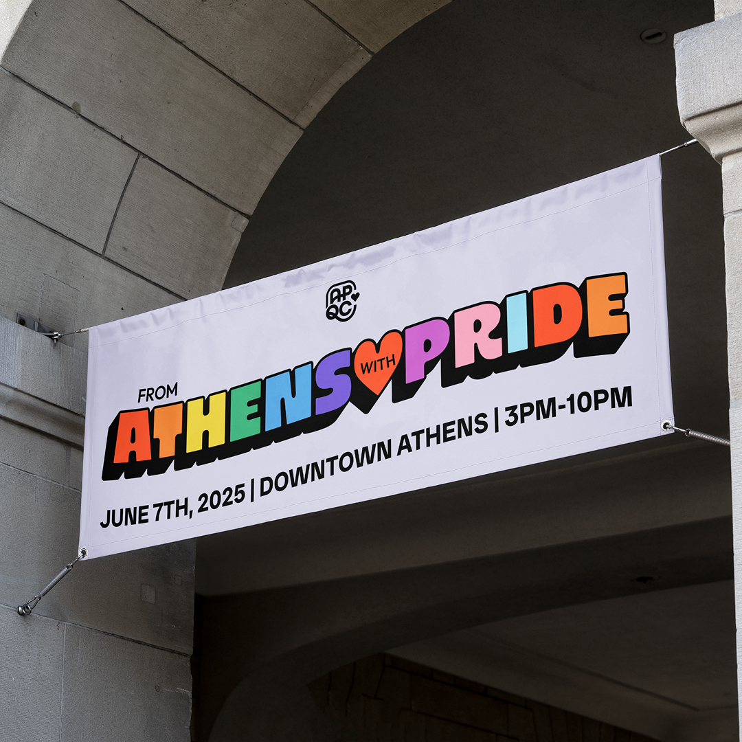
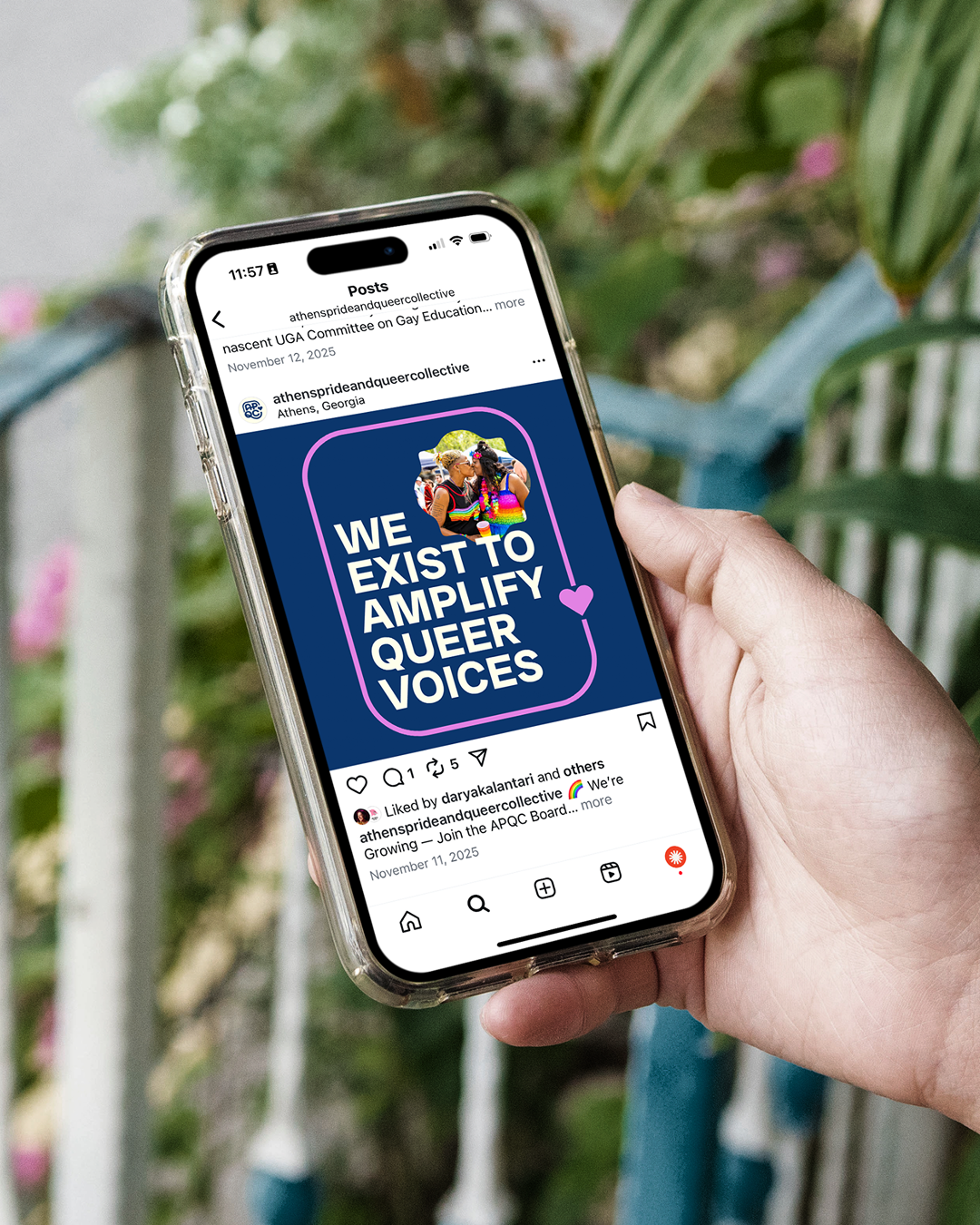
Athens Pride & Queer Collective (APQC) is a nonprofit in Athens, Georgia, dedicated to amplifying queer voices and fostering belonging for all while celebrating diversity and encouraging confidence, pride, and security. The organization supports LGBTQ+ people through programs, events, advocacy, educational workshops, social gatherings, support groups, and initiatives like the Gender-Affirming Care Grant that provide critical resources. Beyond its programming, APQC creates a safe and welcoming space where queer people can connect, be celebrated, and help build a community where everyone can live authentically and proudly.
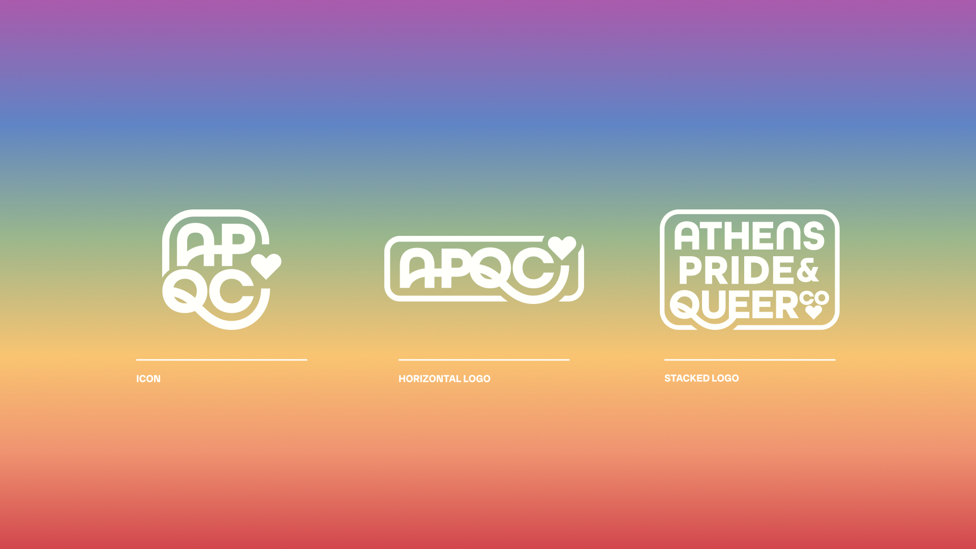
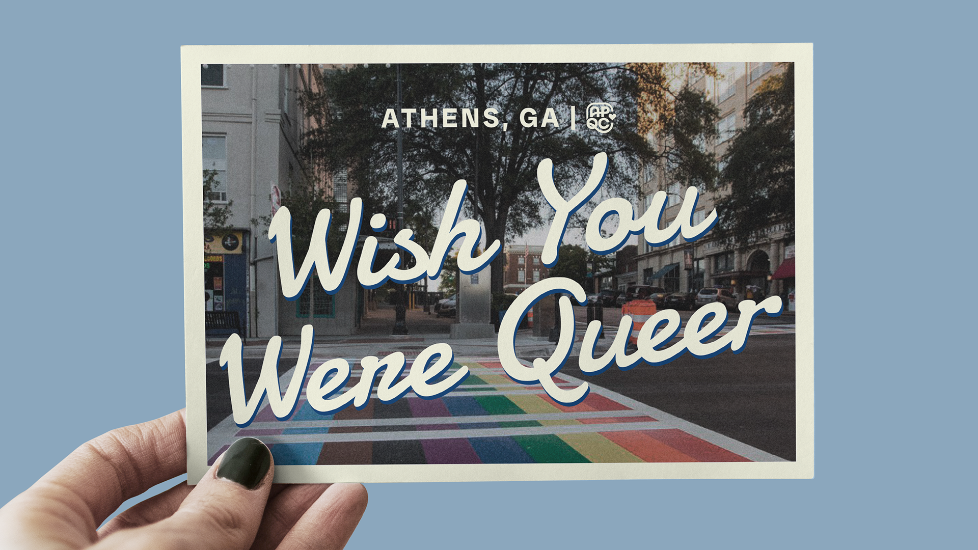
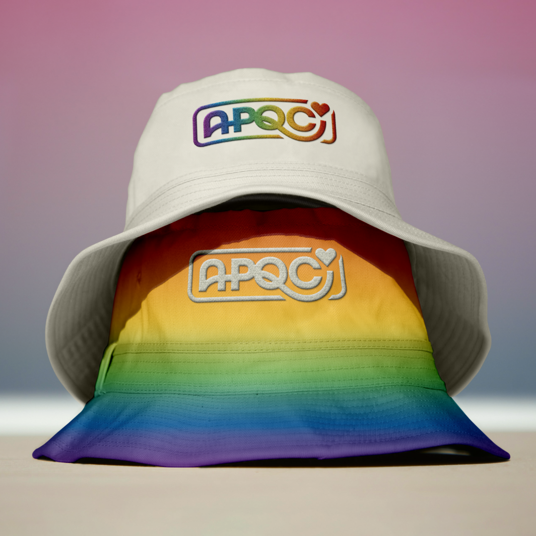
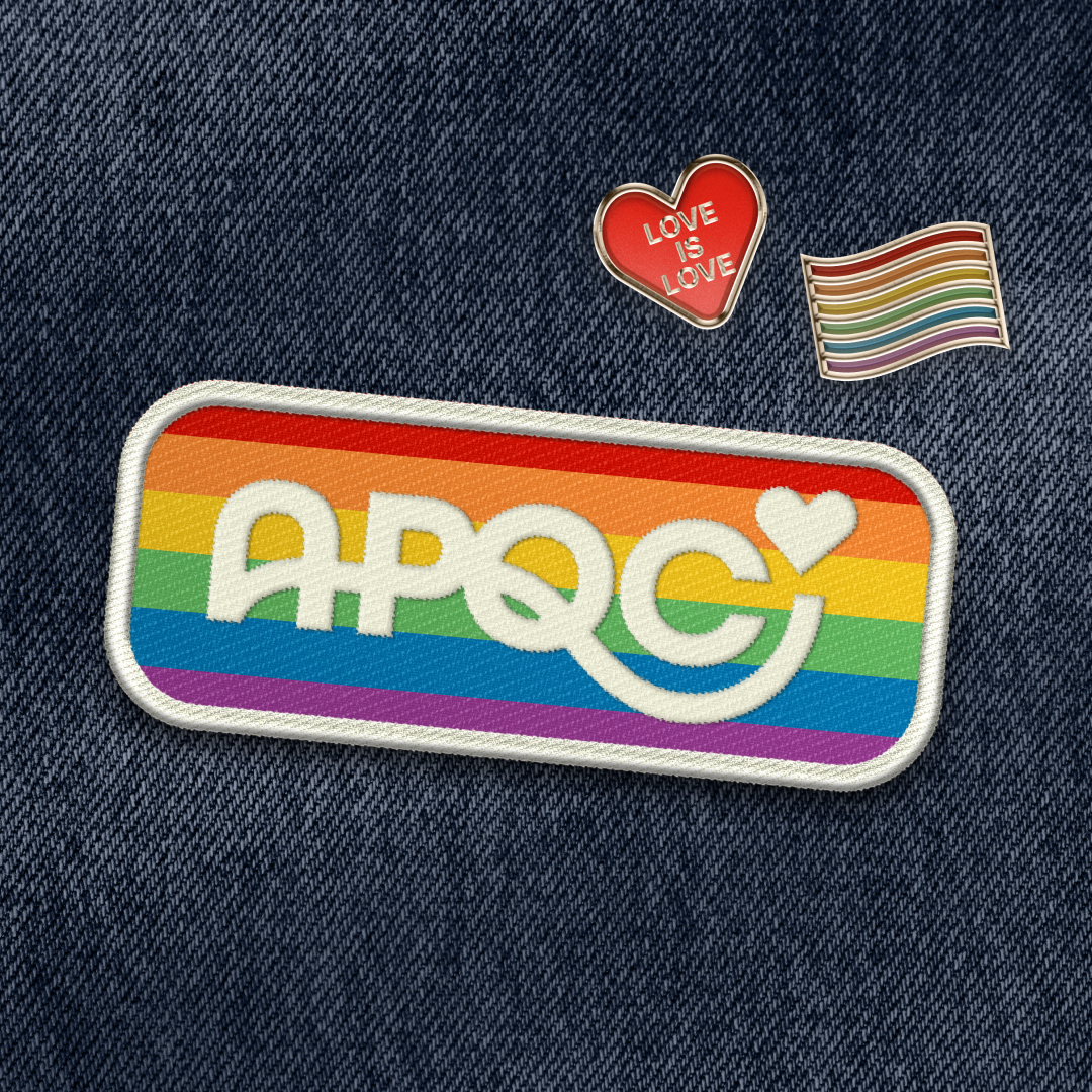
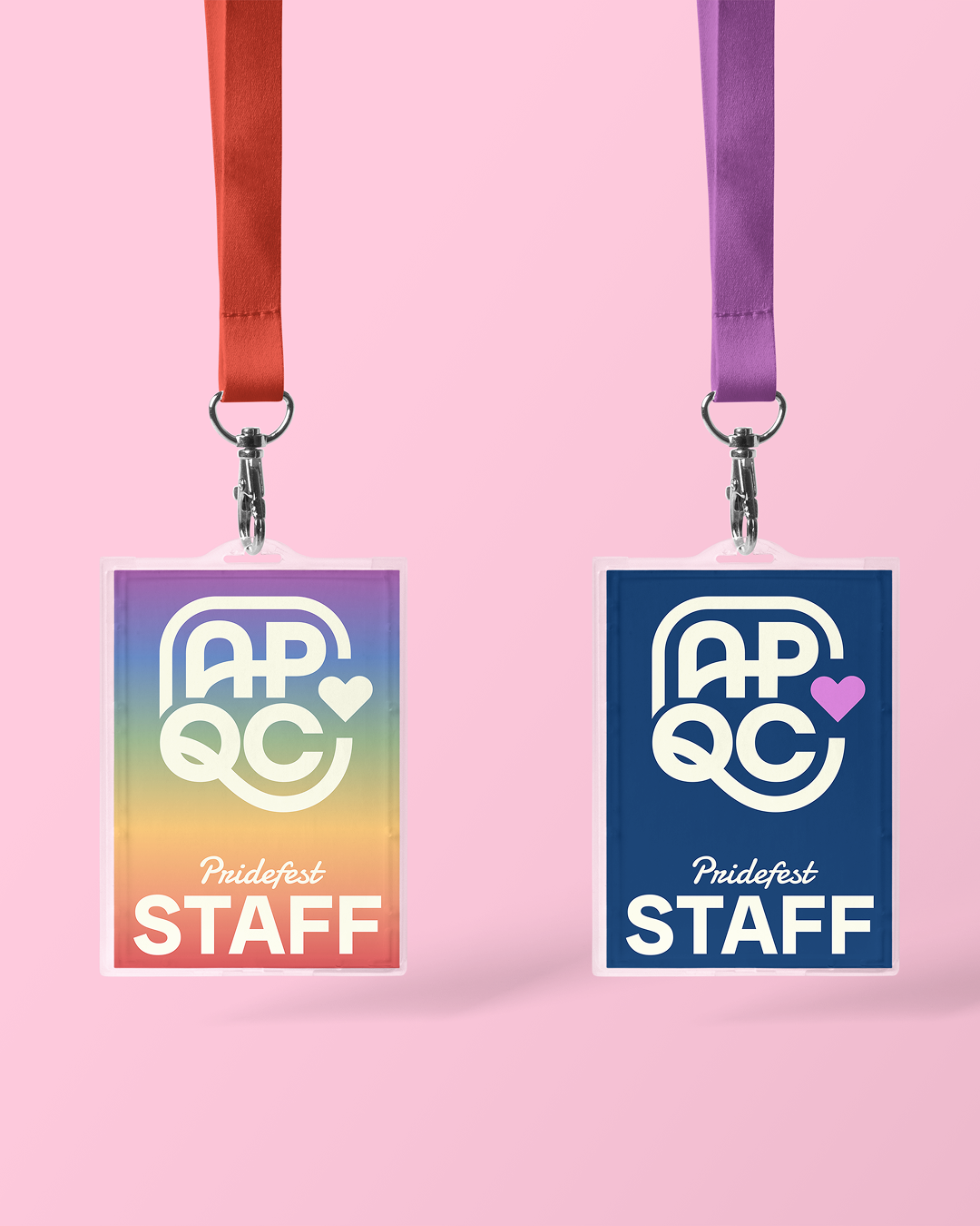
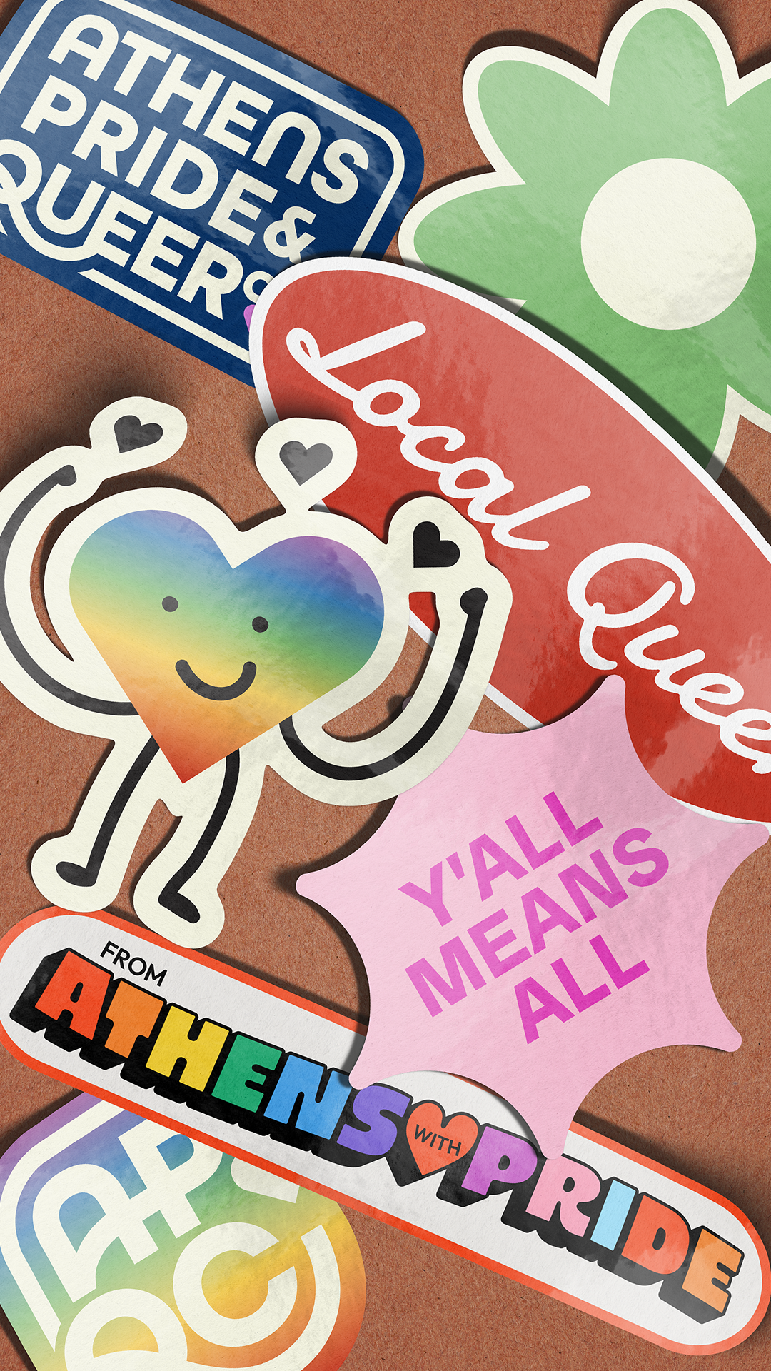
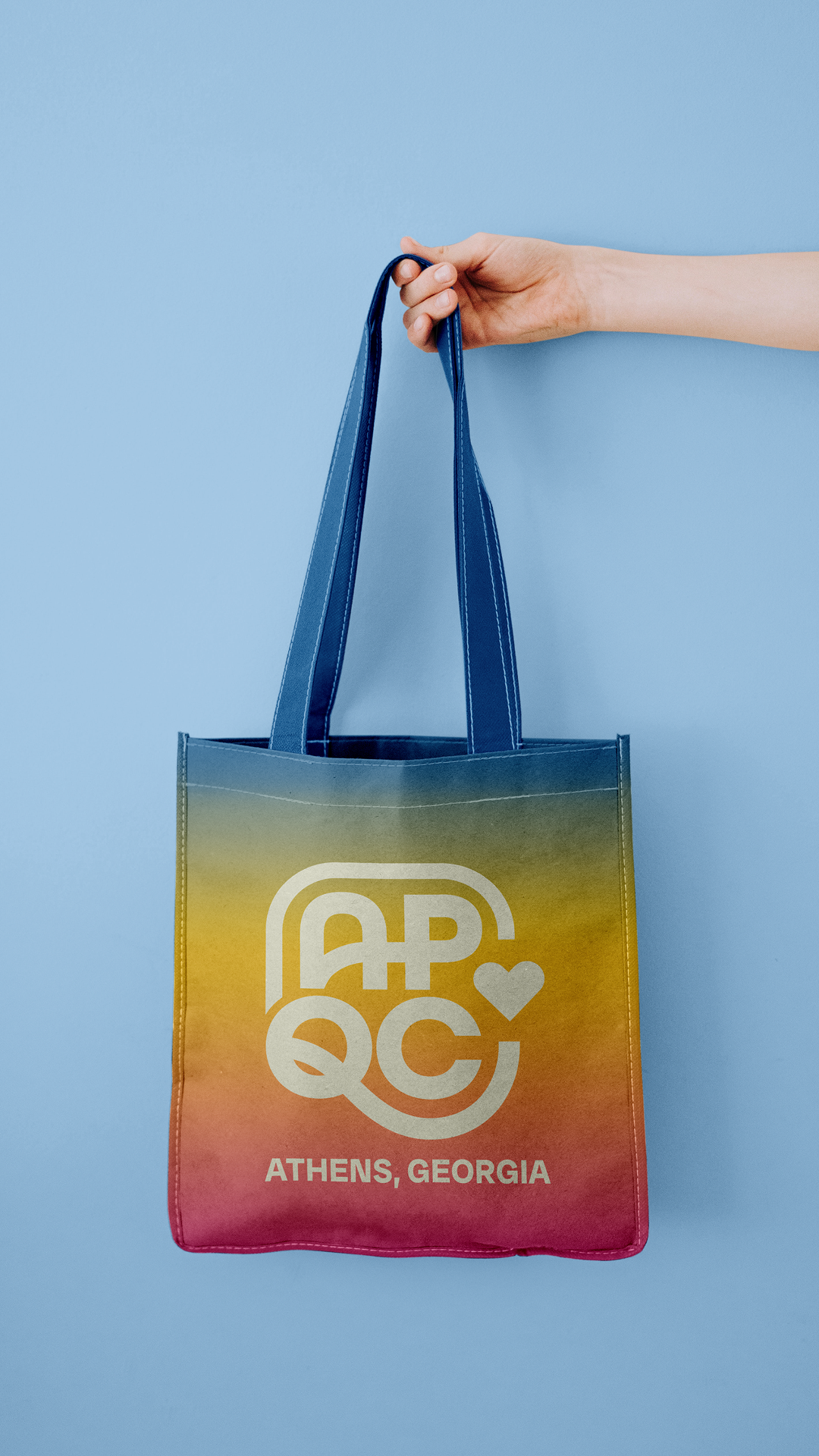
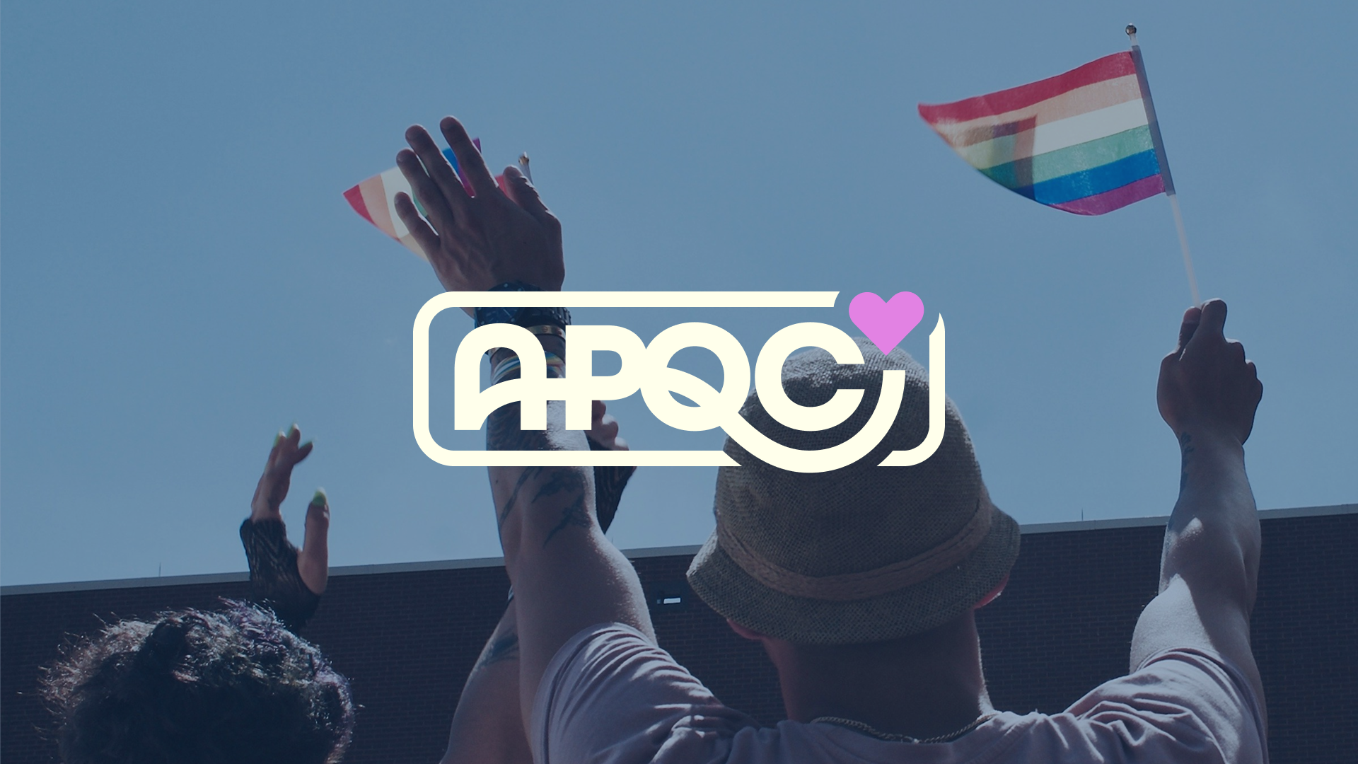
This brand is built to be welcoming, cohesive, and community-driven, reflecting APQC’s mission to empower and celebrate Athens’ LGBTQ+ community. The typeface of the logo connects and holds the marks together, symbolizing how APQC supports and unites the local community. A unique ligature between the “A” and “P” physically links Athens to Pride, while a rounded square shape holds everything together. A custom curly “Q” completes the design, reinforcing
inclusivity and connection.
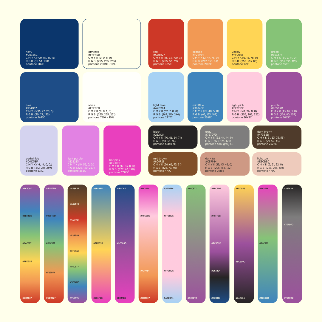
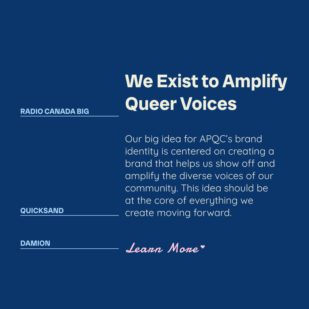
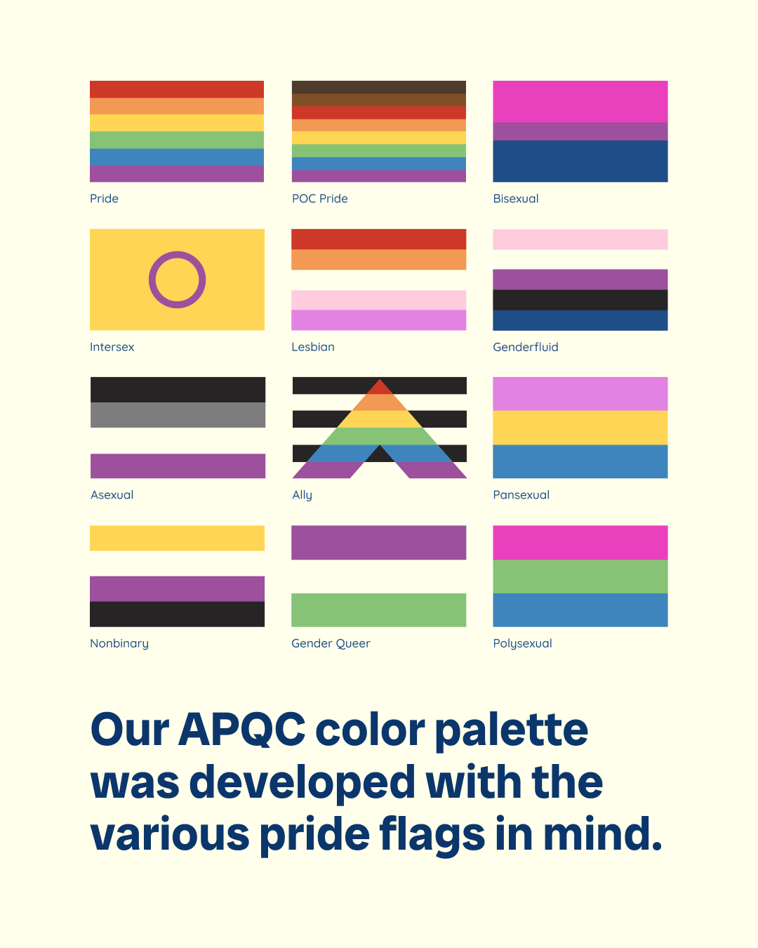
The color palette is bright, inclusive, and rooted in Pride, featuring primary shades of blue, hot pink or purple, and light periwinkle supported by expanded secondary and tertiary palettes for flexibility across applications. Inspired by the many Pride flags, the system includes a wide range of gradients and skin tone colors to reflect the diversity of the community, creating a visual identity that feels vibrant, welcoming, and celebratory. The typography strengthens this identity with Radio Canada Big for bold headlines, Quicksand for approachable body text, and Damion Script for warmth and personality, working together to express a dynamic and cohesive brand.


I spearheaded a dynamic logo concept to introduce variability and make APQC’s brand more engaging across its channels. I designed a flexible set of icons that can replace the heart in the primary logo and adapt to any color in the palette, along with an expressive heart character in playful poses that adds personality and approachability. To ensure long-term growth, I also developed templates for creating future characters, making the system cohesive, versatile, and endlessly adaptable across communications.
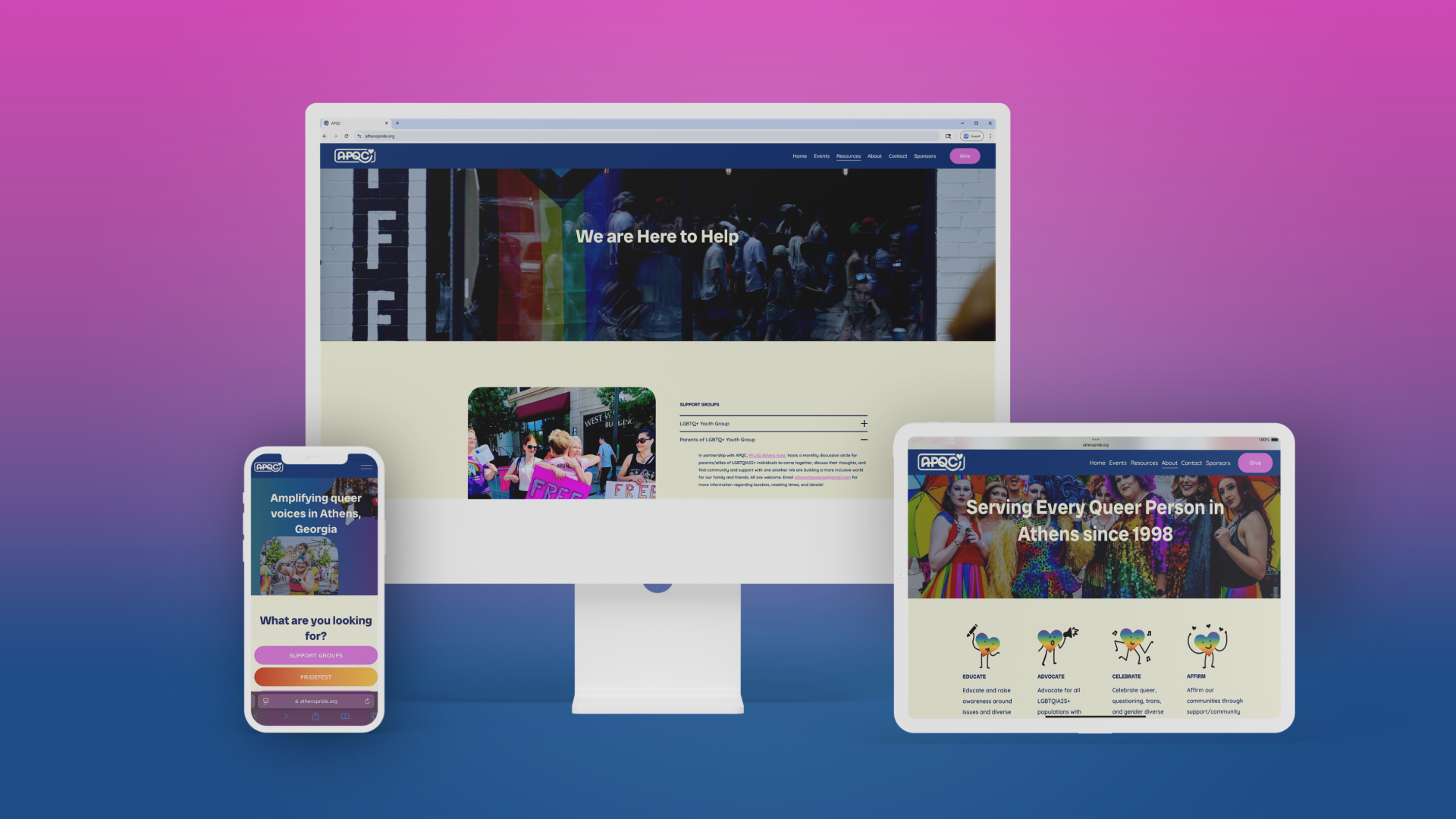
The APQC website was fully rebuilt to reflect the energy, inclusivity, and vibrancy of the new brand, using bold color accents, gradient buttons, and clear layouts to guide visitors toward key actions and community resources. Consistent use of the pride-inspired palette, playful icons, and engaging visuals creates a welcoming and easy-to-navigate online space that reflects the organization’s mission. I collaborated closely with my team, building the wireframes and fully rolling out the website on Squarespace to ensure a cohesive, responsive, and user-friendly experience across devices.