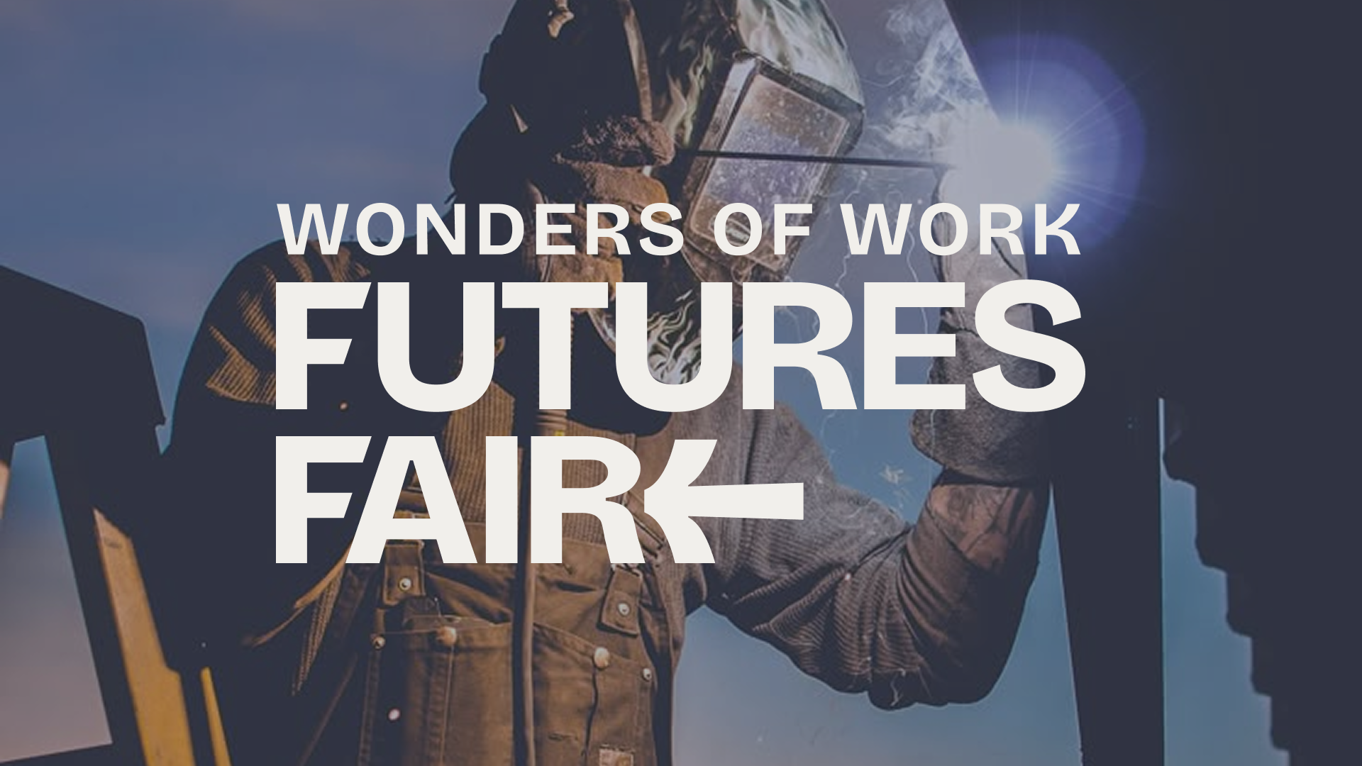
While at Calor Creative, I collaborated in the brand Identity for WOW Future’s Fair, the Clarke County School District’s project to engage with Rising Highschool Freshman.
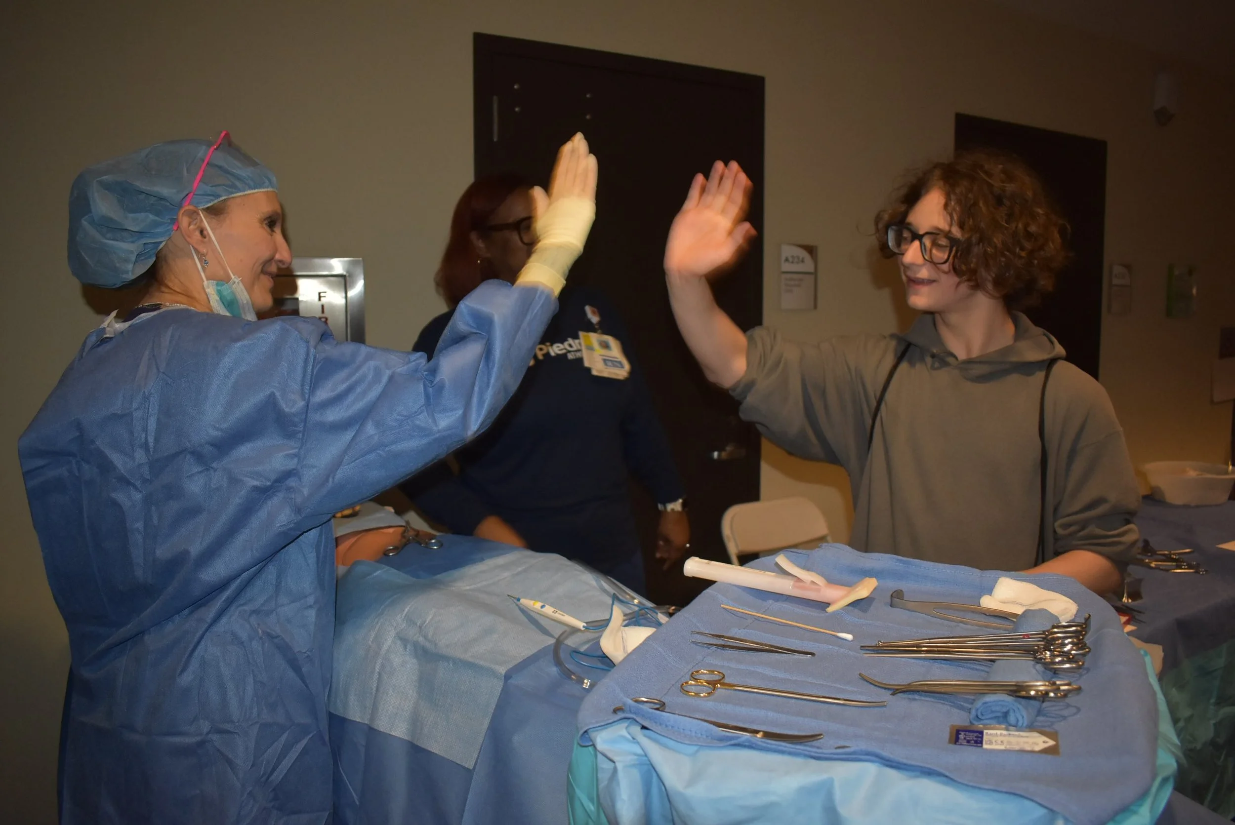
Explore your future at the WOW Futures Fair! This interactive event is designed for 8th graders in Athens-Clarke County schools to learn about different careers and opportunities in their community. With hands-on activities, engaging booths, and adults ready to share their experiences, students can see what is possible right here in Athens. The WOW Futures Fair connects students with careers and resources in a welcoming environment. Students leave inspired, confident, and ready to say, “I can do this!” The fair is about exploring possibilities, building confidence, and imagining a bright future.
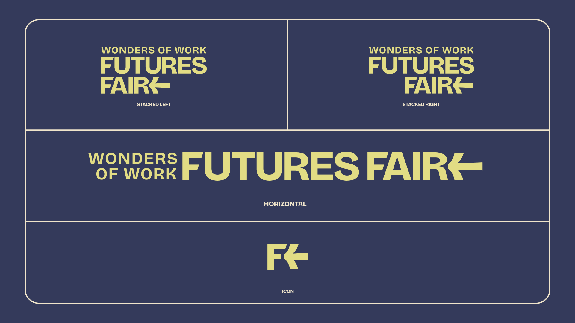
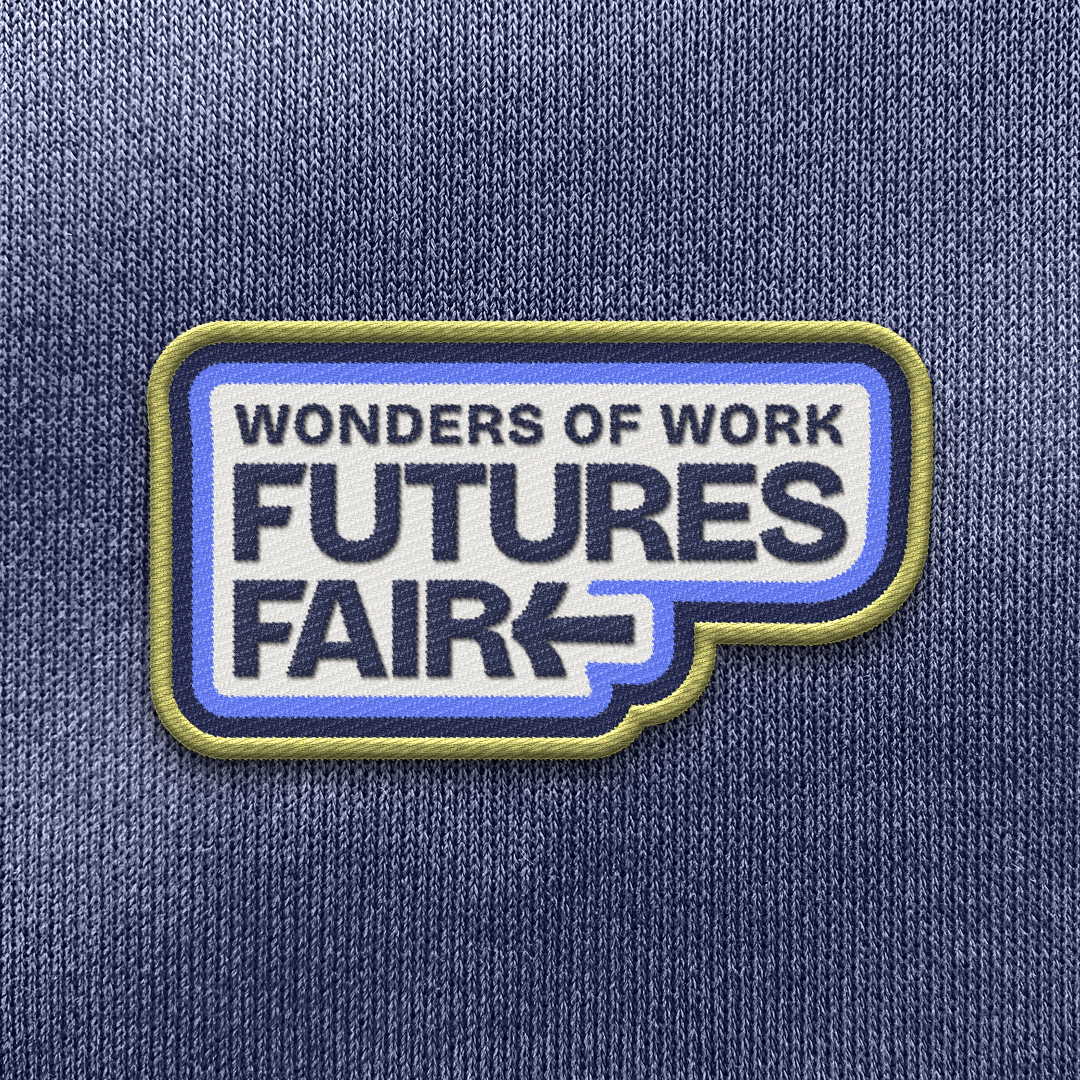
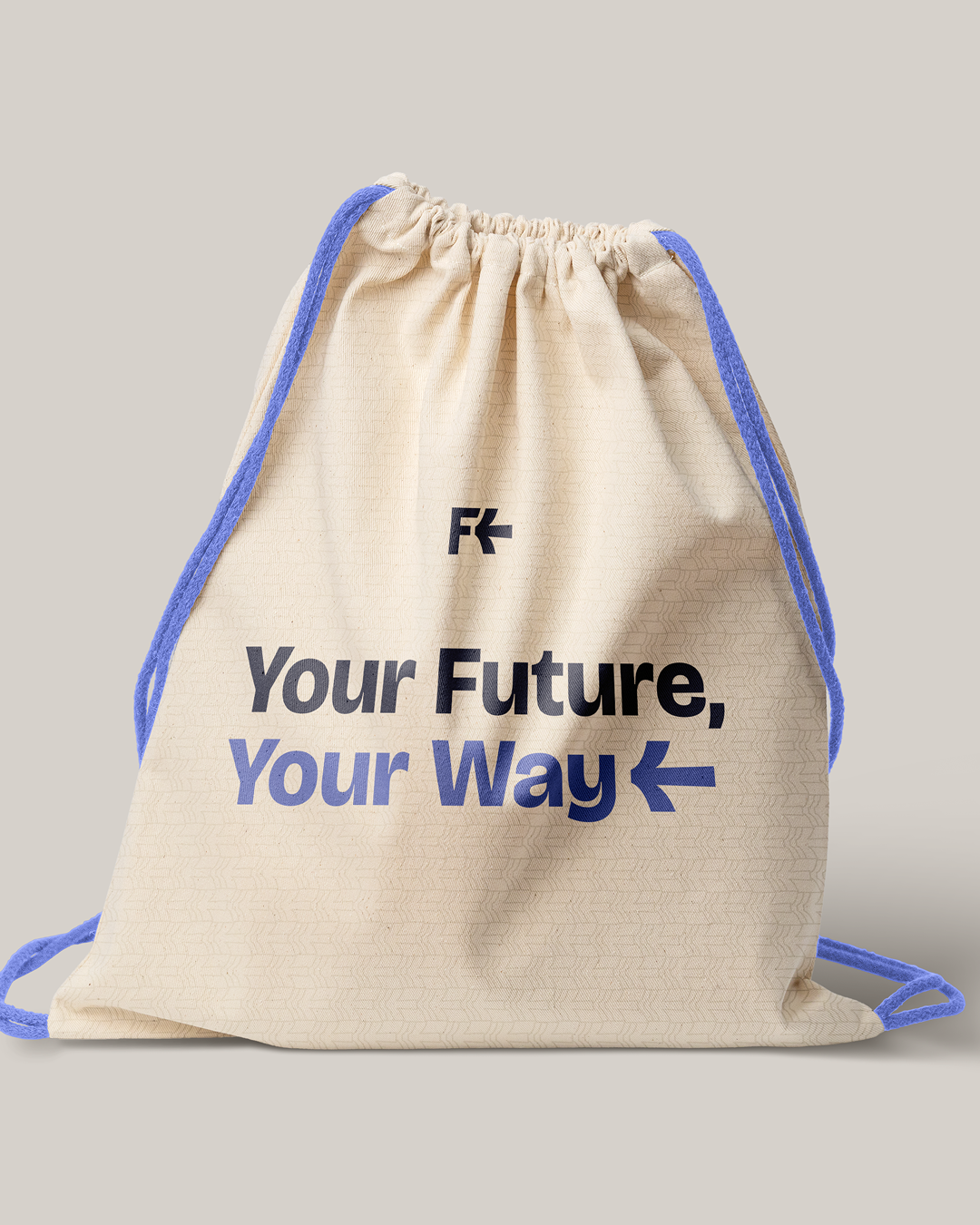
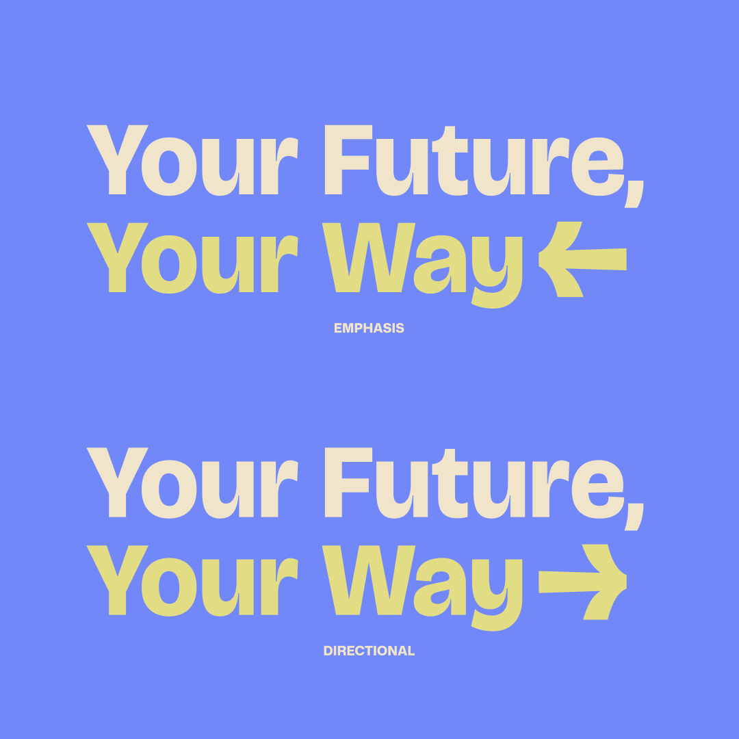
Their logo kit includes an icon, a horizontal logo, and stacked versions aligned left or right, providing flexibility for different uses. The arrow is a key element, always pointing inward to draw attention and emphasize important content. It reflects the fair’s focus on showing students that there are many paths to success, while creating a strong, recognizable identity for the event.
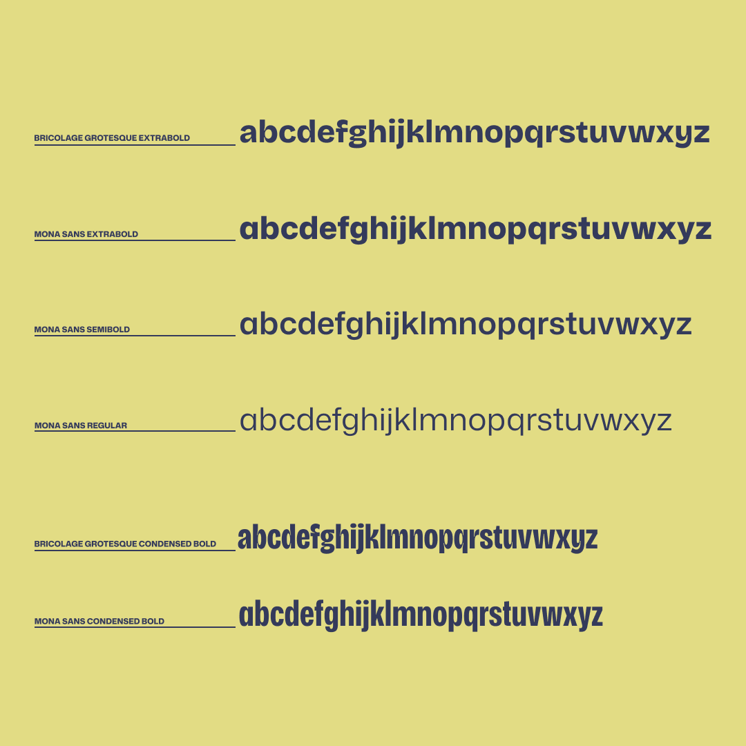
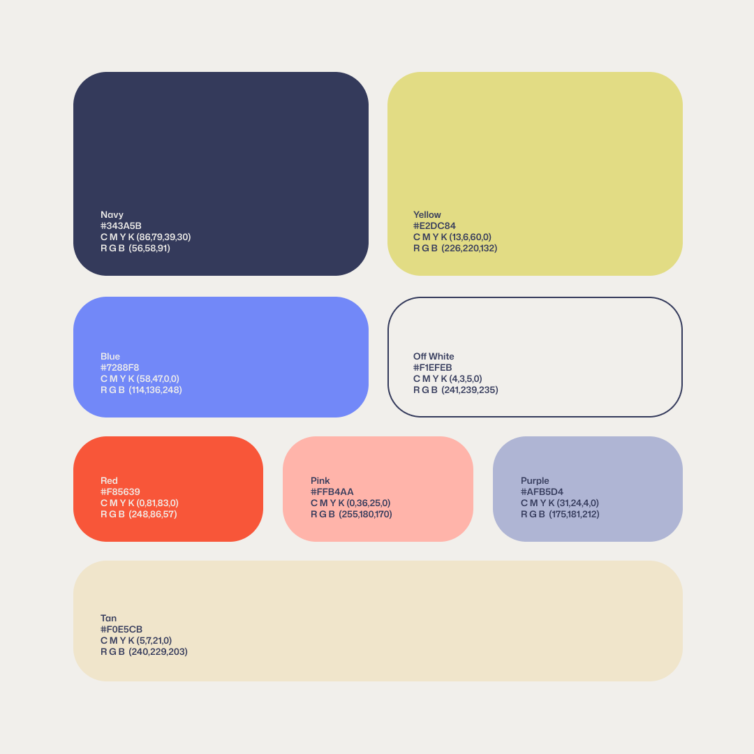
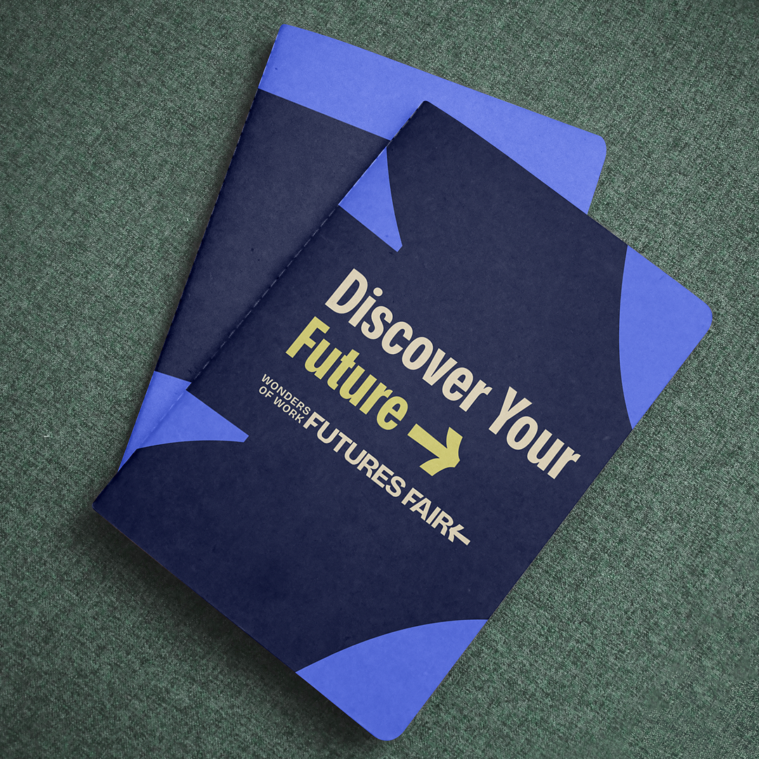
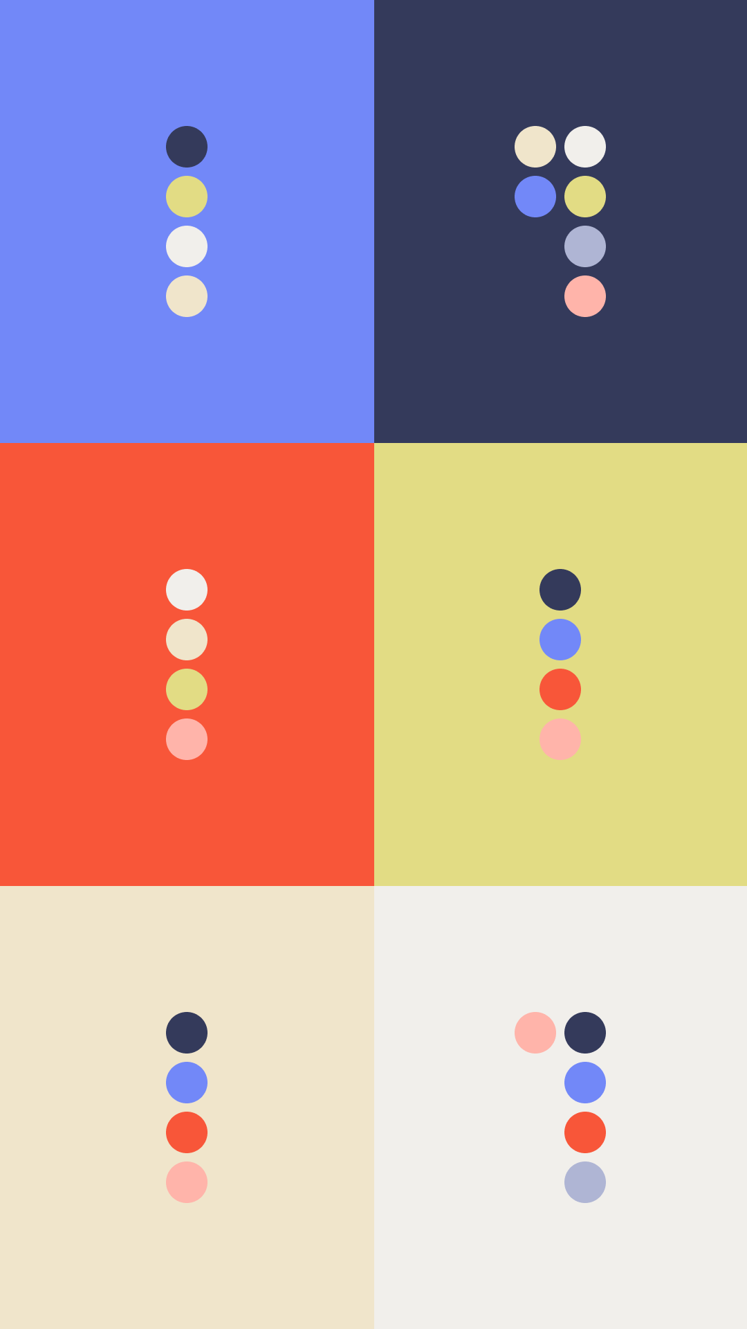
The brand uses a bold, modern color palette of navy, bright yellow, and tan. These colors are designed to feel fresh and energetic, capturing the attention of young teens and creating a sense of excitement around the event. The typography is equally modern and distinctive, with headlines set in Bricolage Grotesque, available in condensed and normal styles, and body text in Mona Sans. Together, the colors and type create a fun, contemporary, and unique visual identity that reflects the energy and purpose of the Futures Fair.
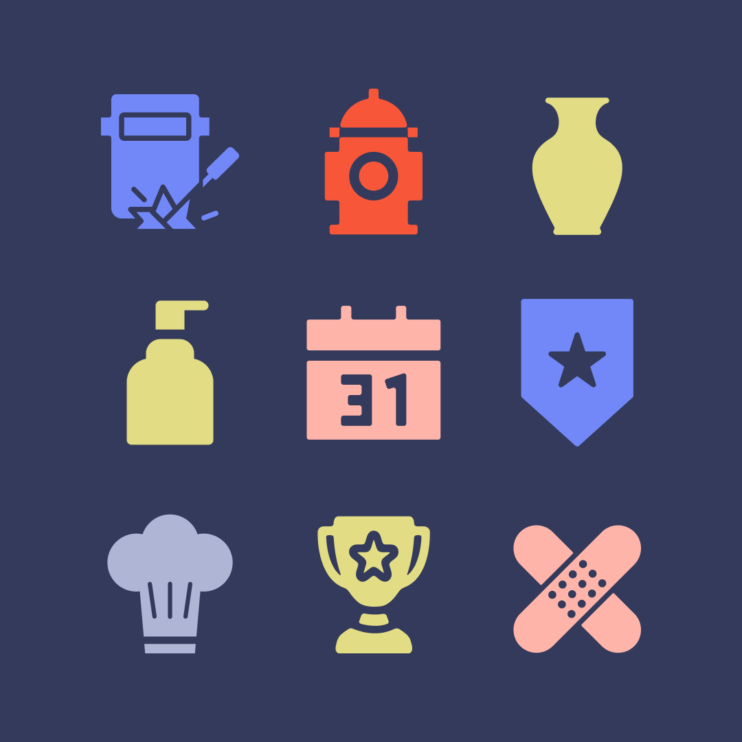
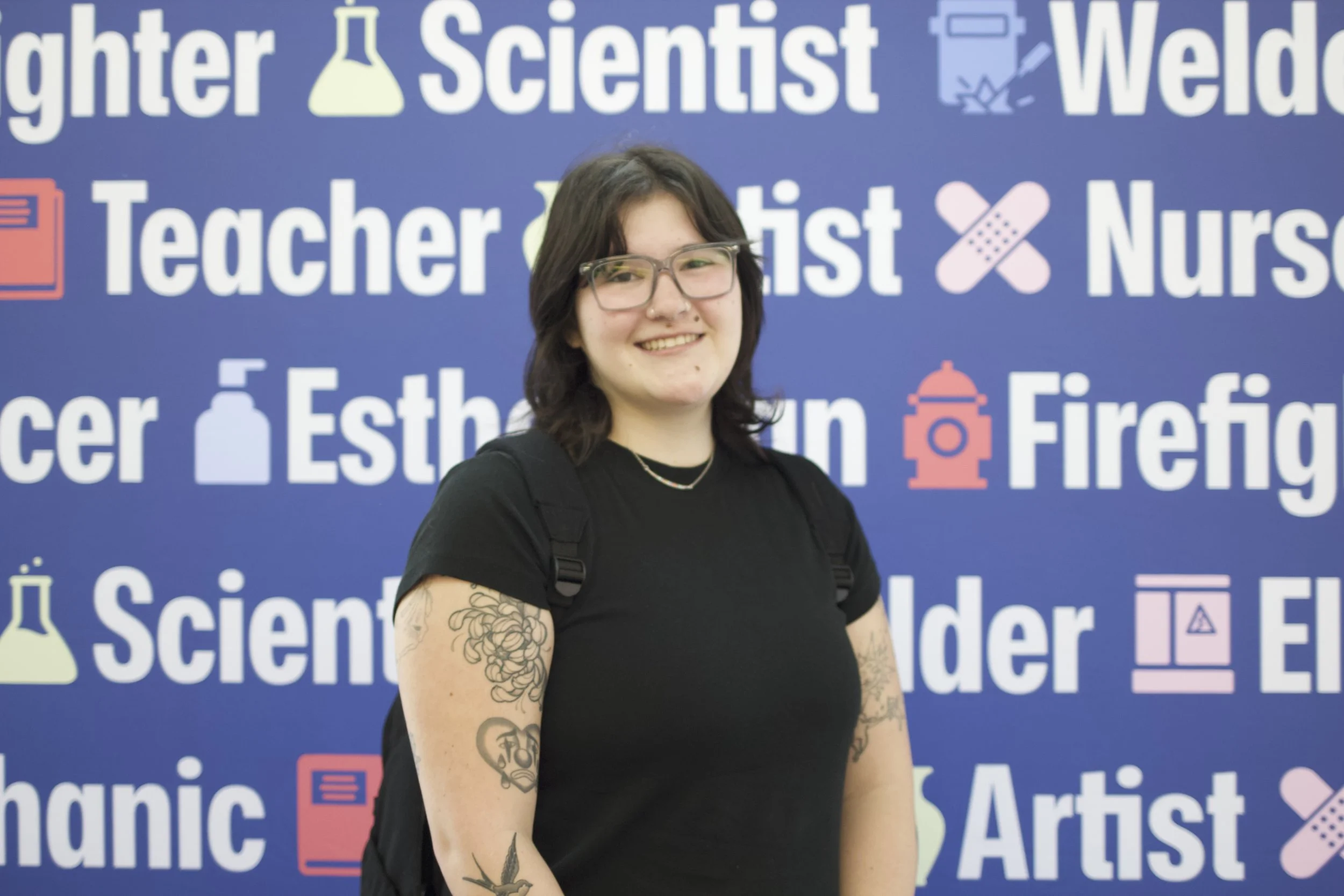
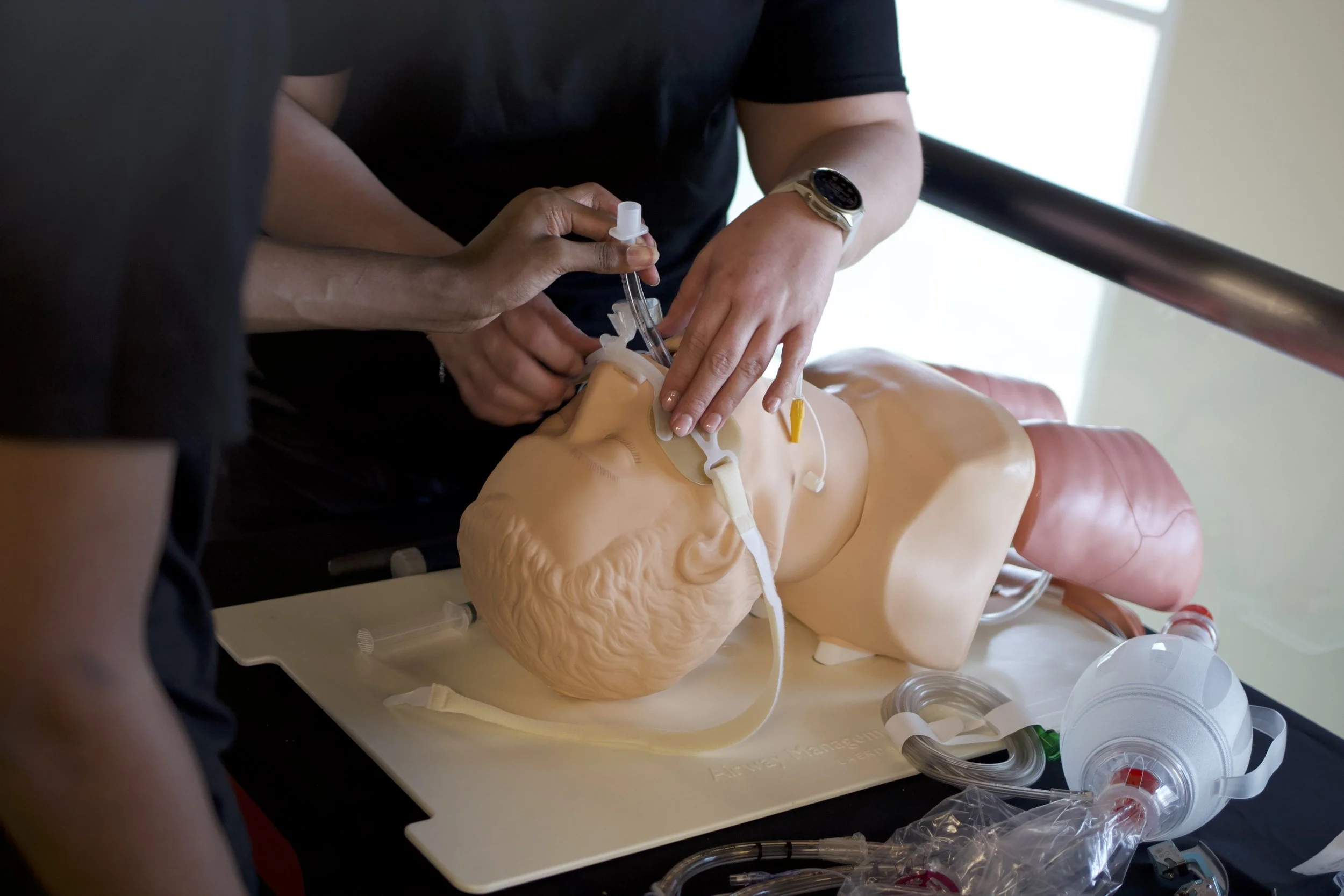
Custom icons represent careers at the WOW Futures Fair: healthcare (bandaids), cosmetology (lotion bottle), first responder (badge & fire hydrant), education (notebook), manufacturing (welding shield), skilled trades (electrical box), science (flask), and automotive (gear). Extras include a trophy, event manager, artist, and chef hat. These icons appear in visuals and stickers, helping engage students, while the inward-pointing arrow highlights key information and reinforces the idea of many paths to success.
The arrow is a core part of the brand and should always remain fixed in the logo, pointing inward. In other visual designs, the arrow can be flipped or repositioned to emphasize key information or suggest movement and direction. This flexibility makes the arrow a versatile tool in communications, allowing the brand to feel dynamic and engaging. By using the arrow in different ways outside the logo, the brand becomes more memorable and helps guide attention in a fun, impactful way.
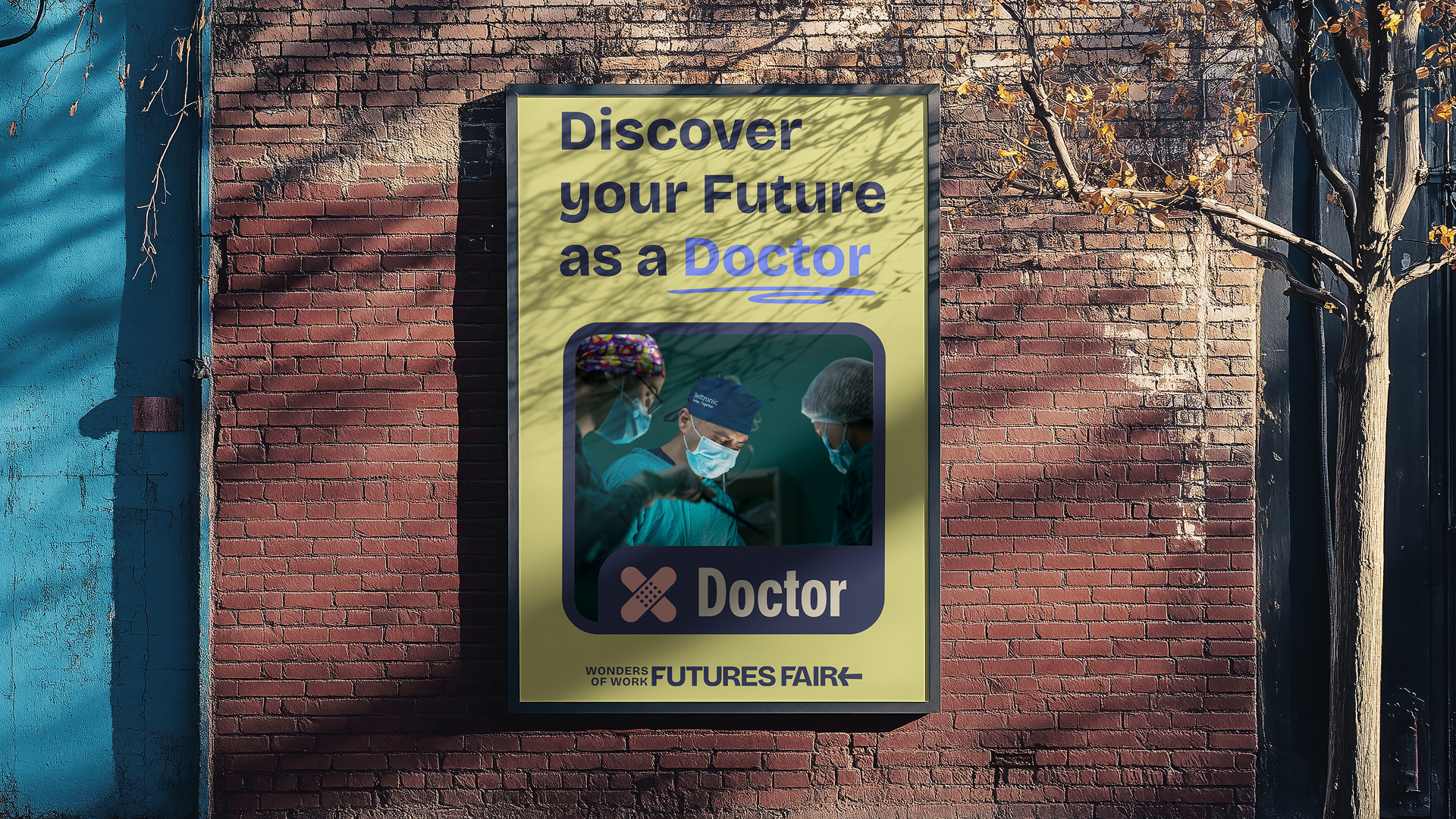
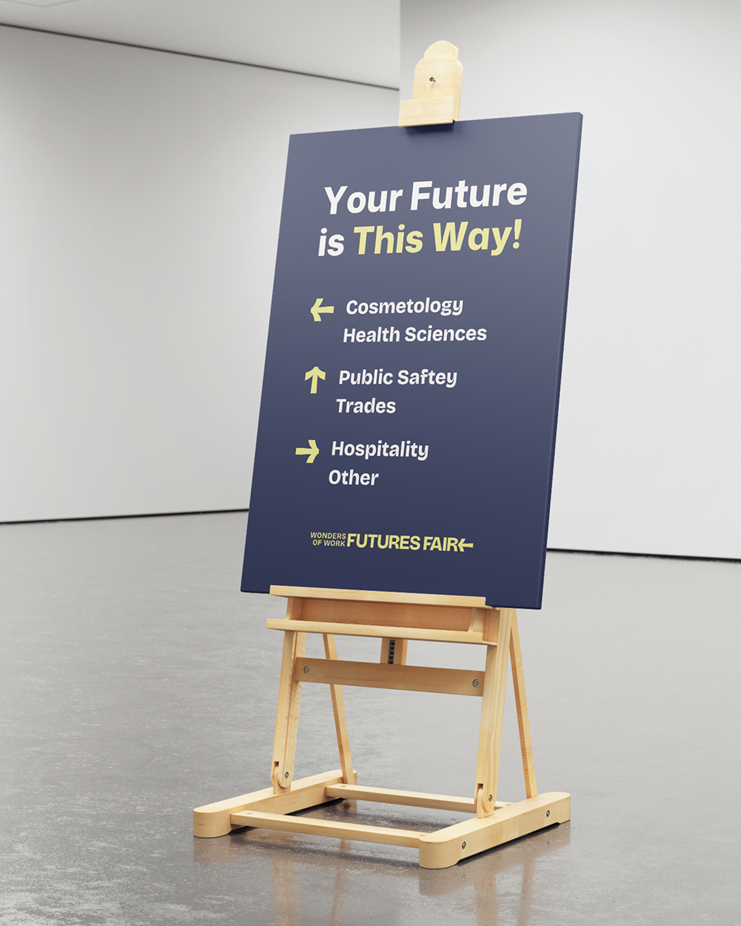
The additional assets were a seamless extension of the brand identity, bringing the established visual system to life across social posts, signage, and flyers. I led the development of these materials by thoughtfully applying the brand’s typography, color palette, and graphic elements to ensure consistency across every touchpoint. Each design was tailored to its format, with social posts focused on dynamic engagement and signage and flyers emphasizing clarity and hierarchy. By utilizing the brand strategically, I created a cohesive set of assets that strengthened recognition and delivered a unified, impactful experience.
The motion assets extended the brand identity into engaging social animations, transitional sequences, and outros. I created the primary social animation by bringing the brand’s typography, color palette, and graphic elements into motion to add energy while maintaining consistency. I also helped direct and collaborate on the transitions and outro alongside our team and the team at Calor Creative. Together, we developed a cohesive animation system that strengthened brand recognition and delivered a polished, impactful digital presence.
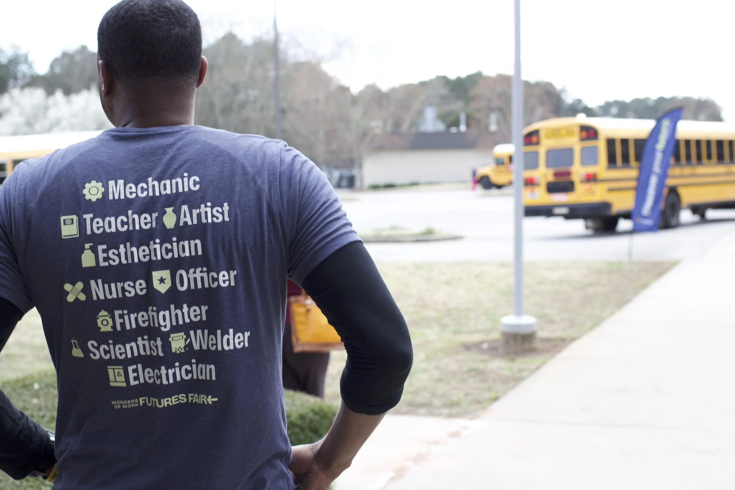
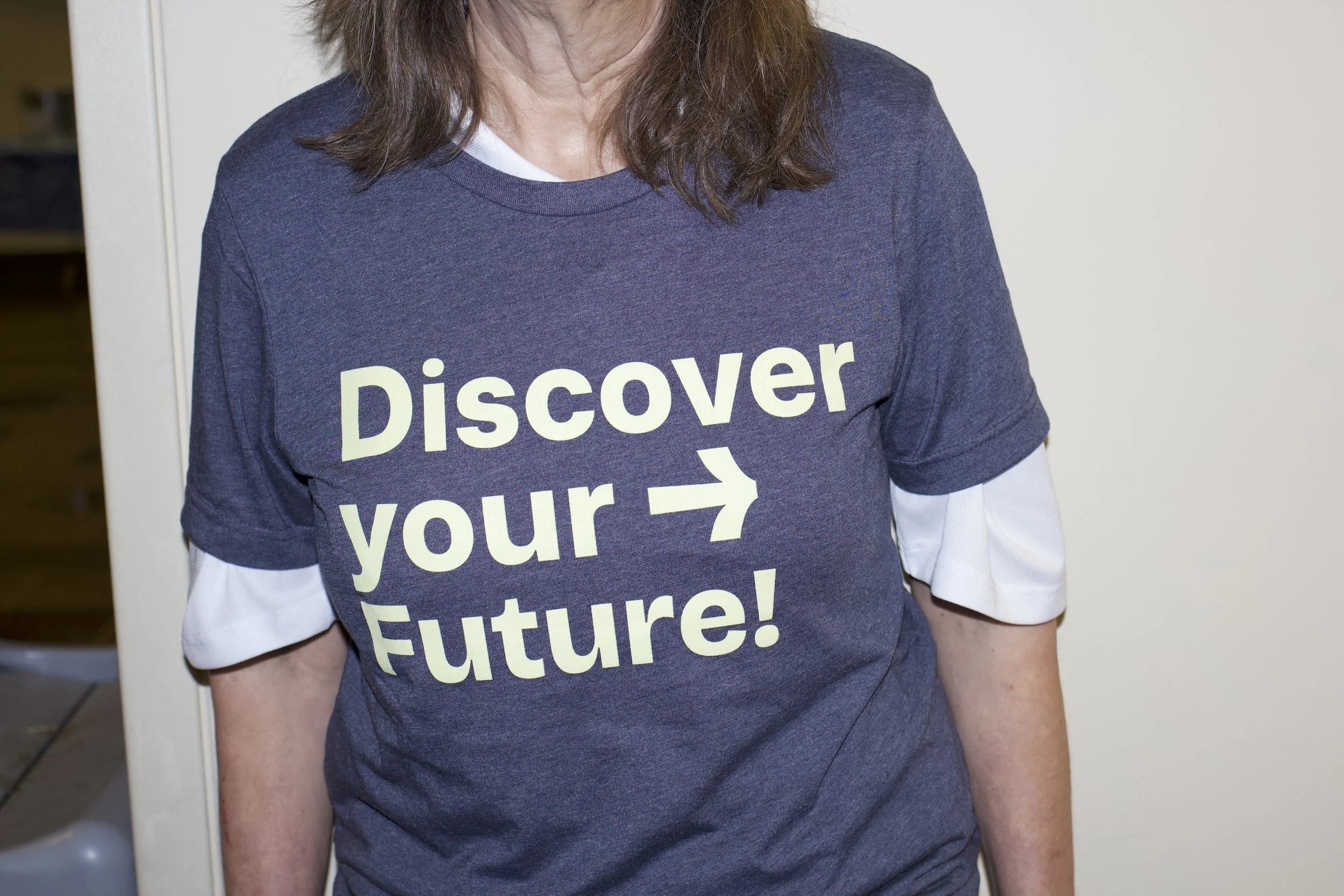
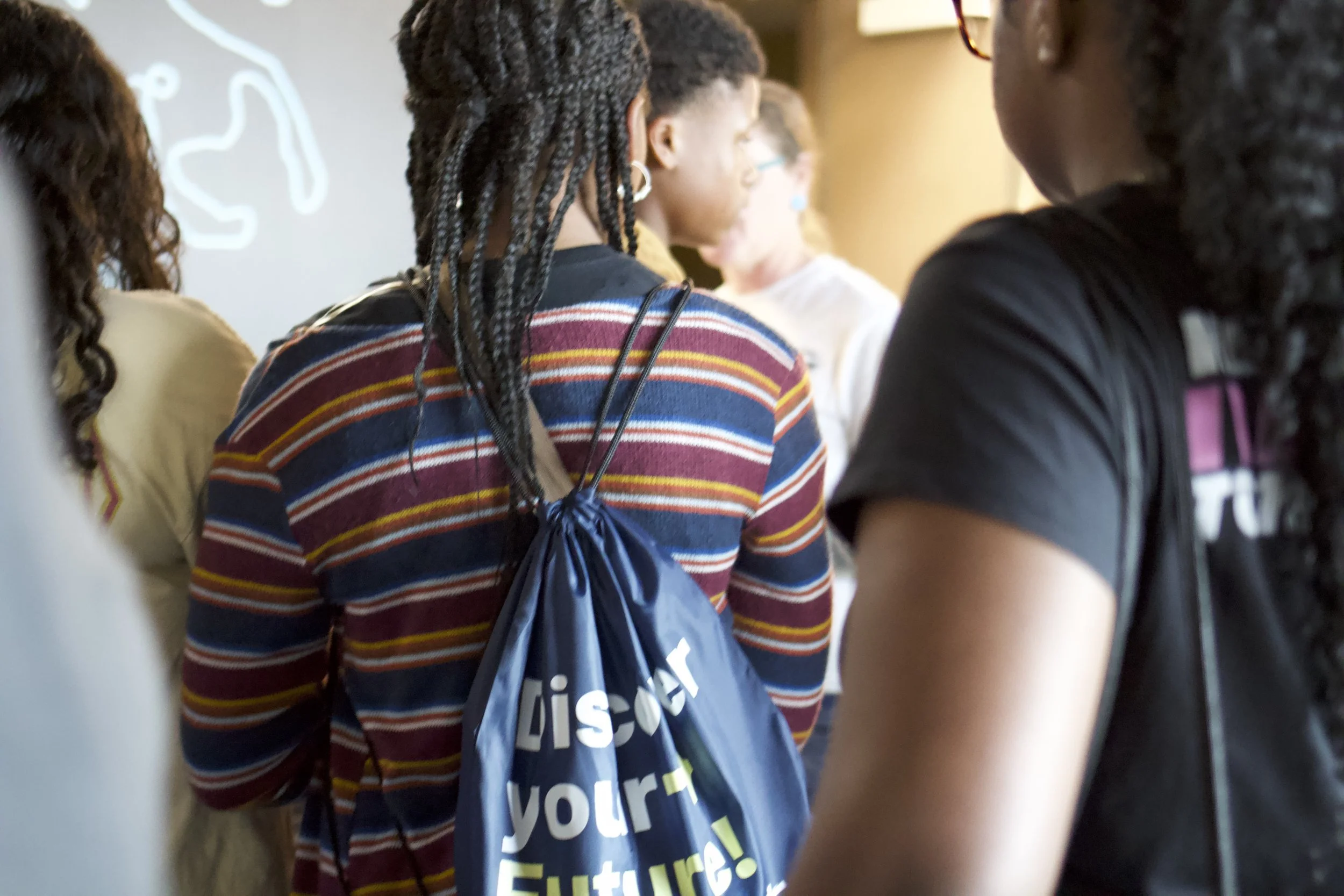
I contributed to the creation of the volunteer merchandise by helping design the shirts worn by the event team and assisting with the design of the sling bags. My role involved coordinating the visual elements and ensuring the designs were clear, cohesive, and representative of the event. The volunteer shirts and sling bags helped create a unified look for the team, making volunteers easily identifiable while also supporting the event’s branding and professional atmosphere.
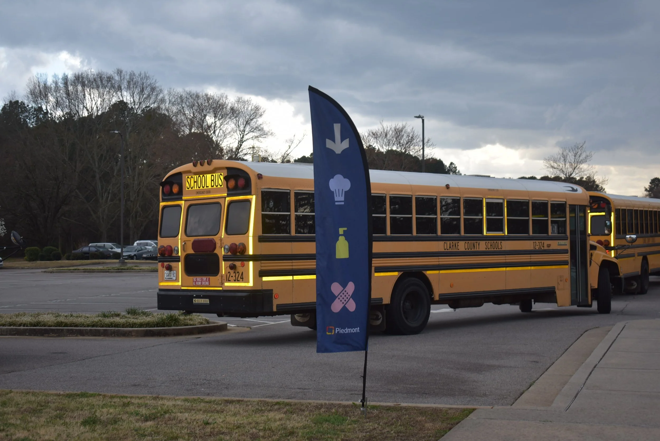
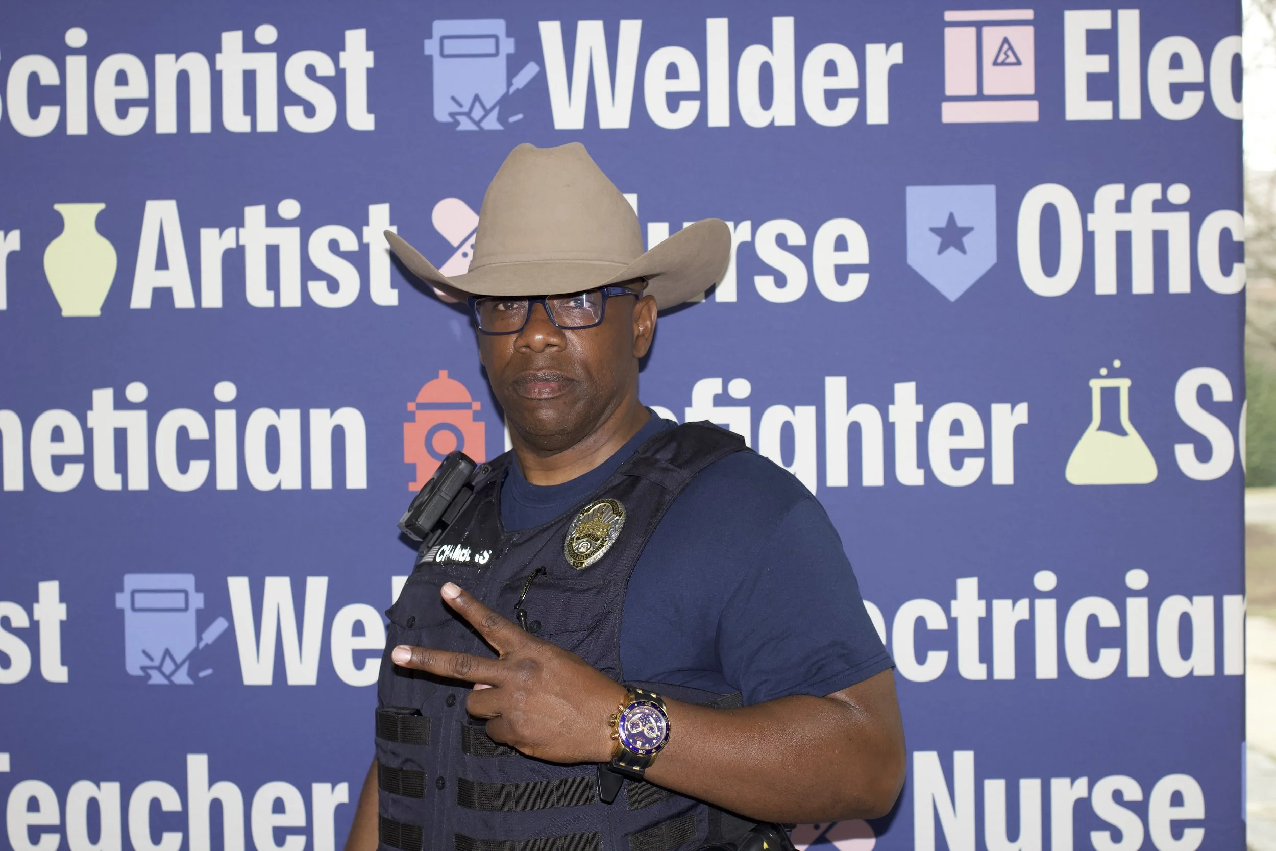
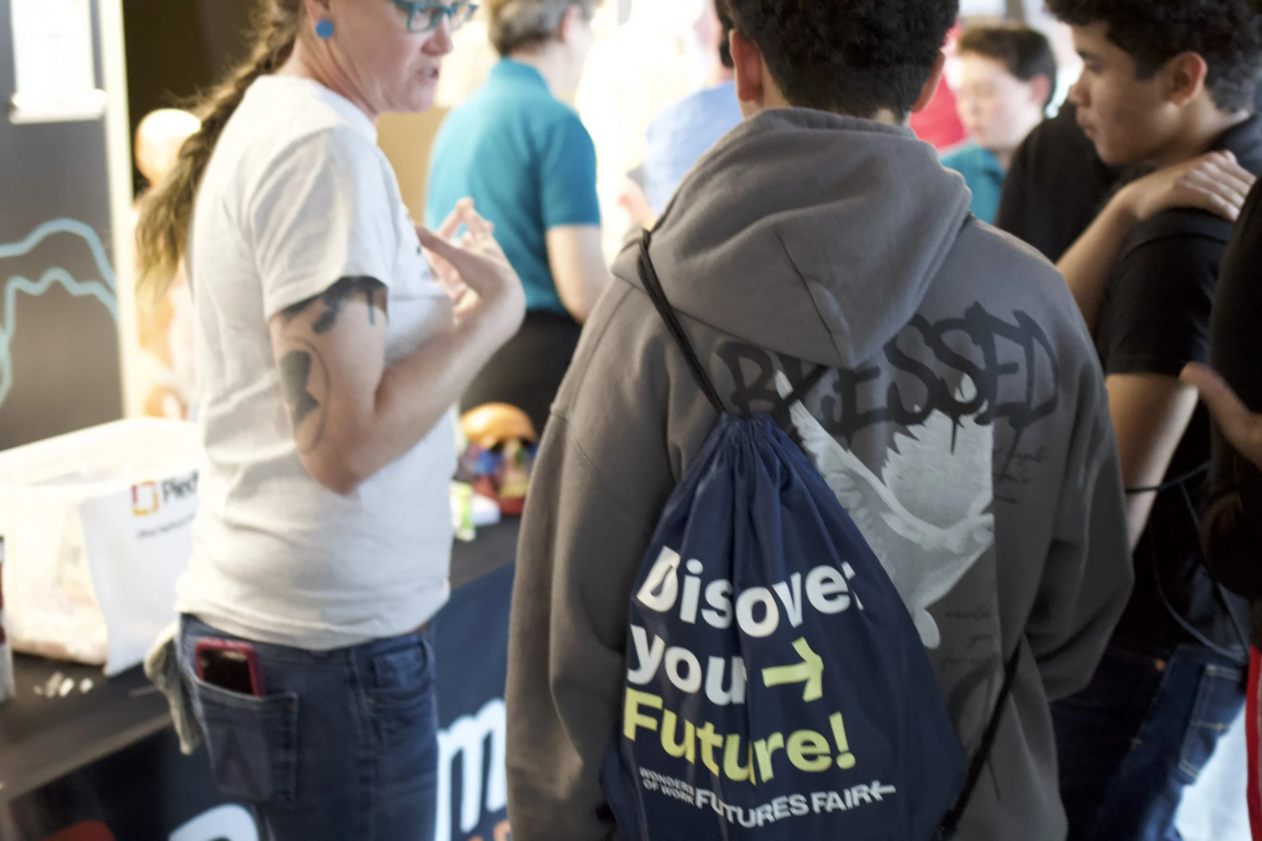
We also created visual materials to enhance the event experience, including feather banners used for directional signage and a photo backdrop for students. The feather banners helped guide attendees around the event space and made important areas easy to find. In addition, the photo backdrop provided a fun and engaging space for students to take pictures, helping create memorable moments while also contributing to the overall visual branding of the event.
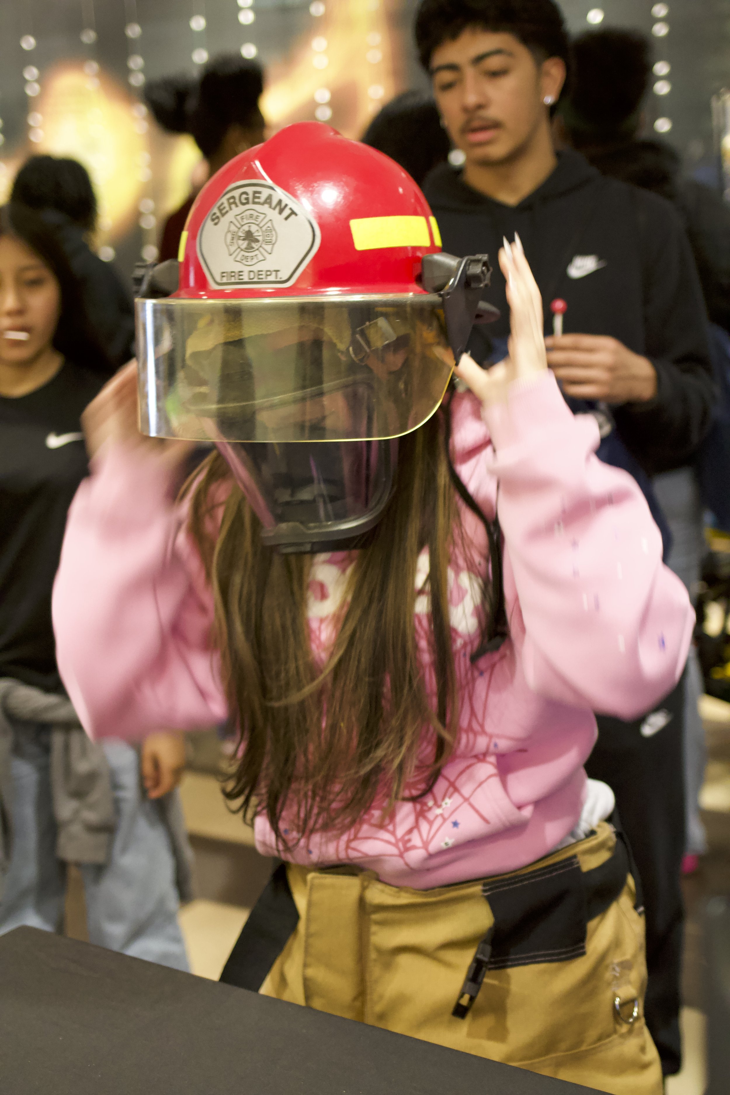
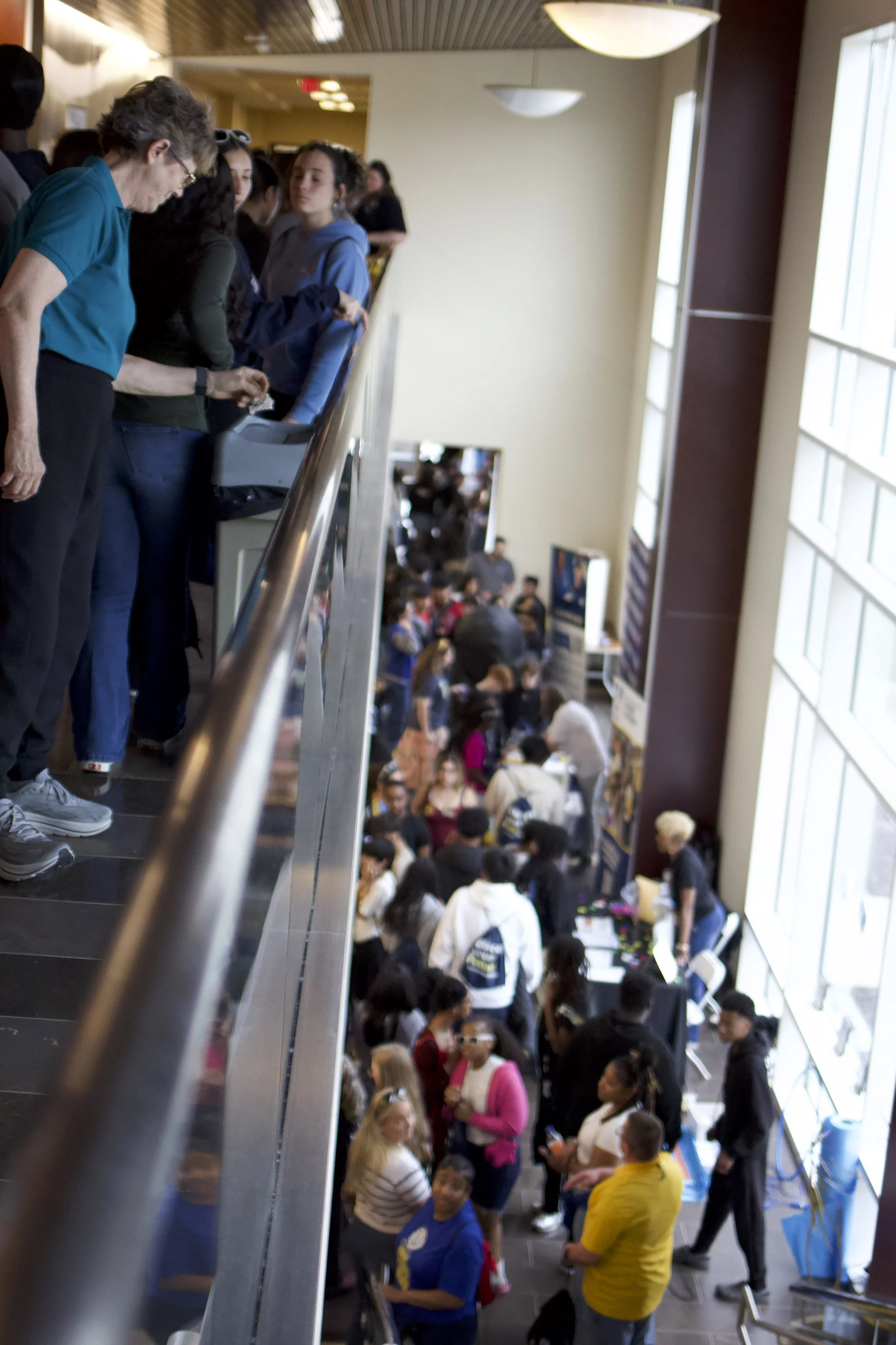
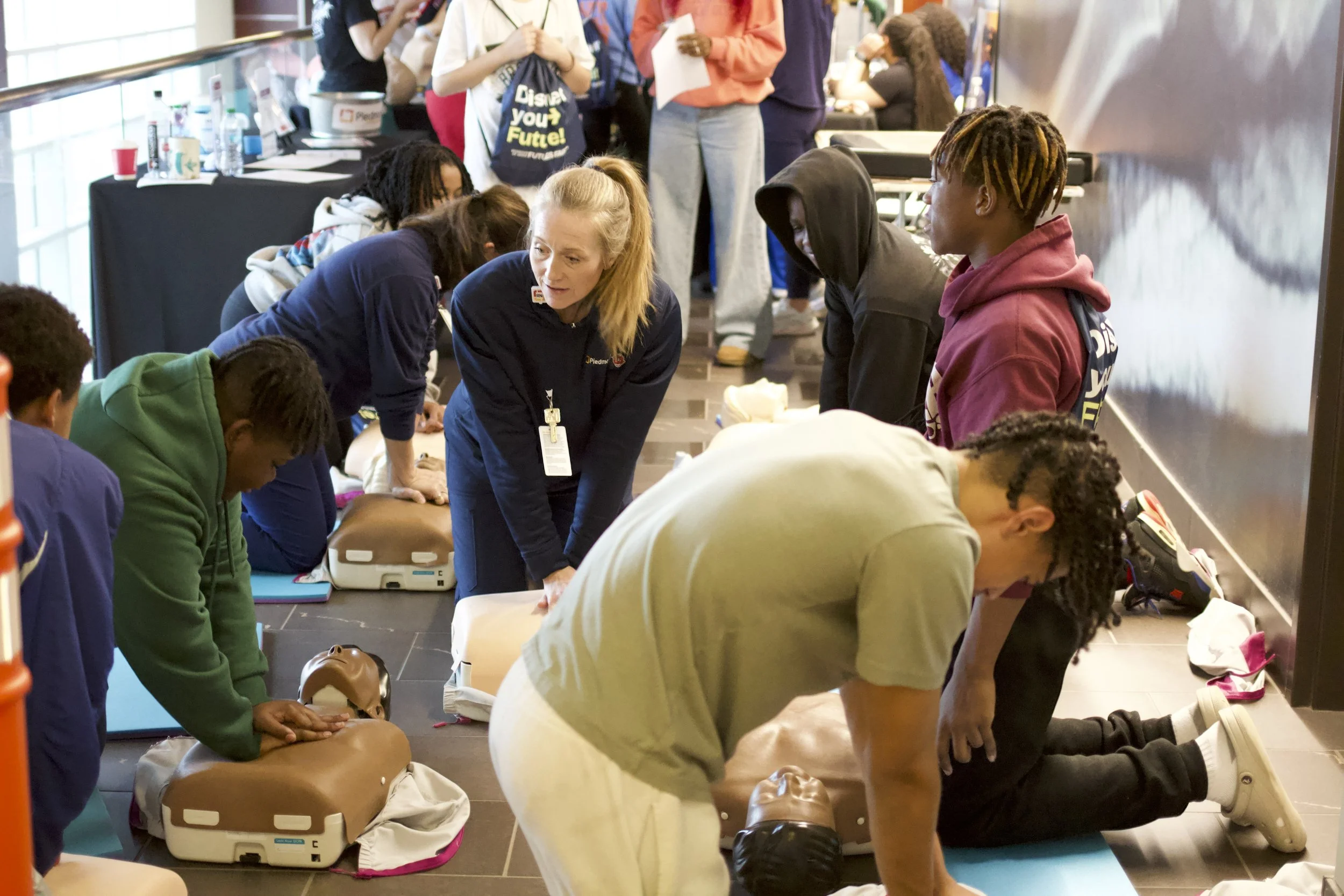
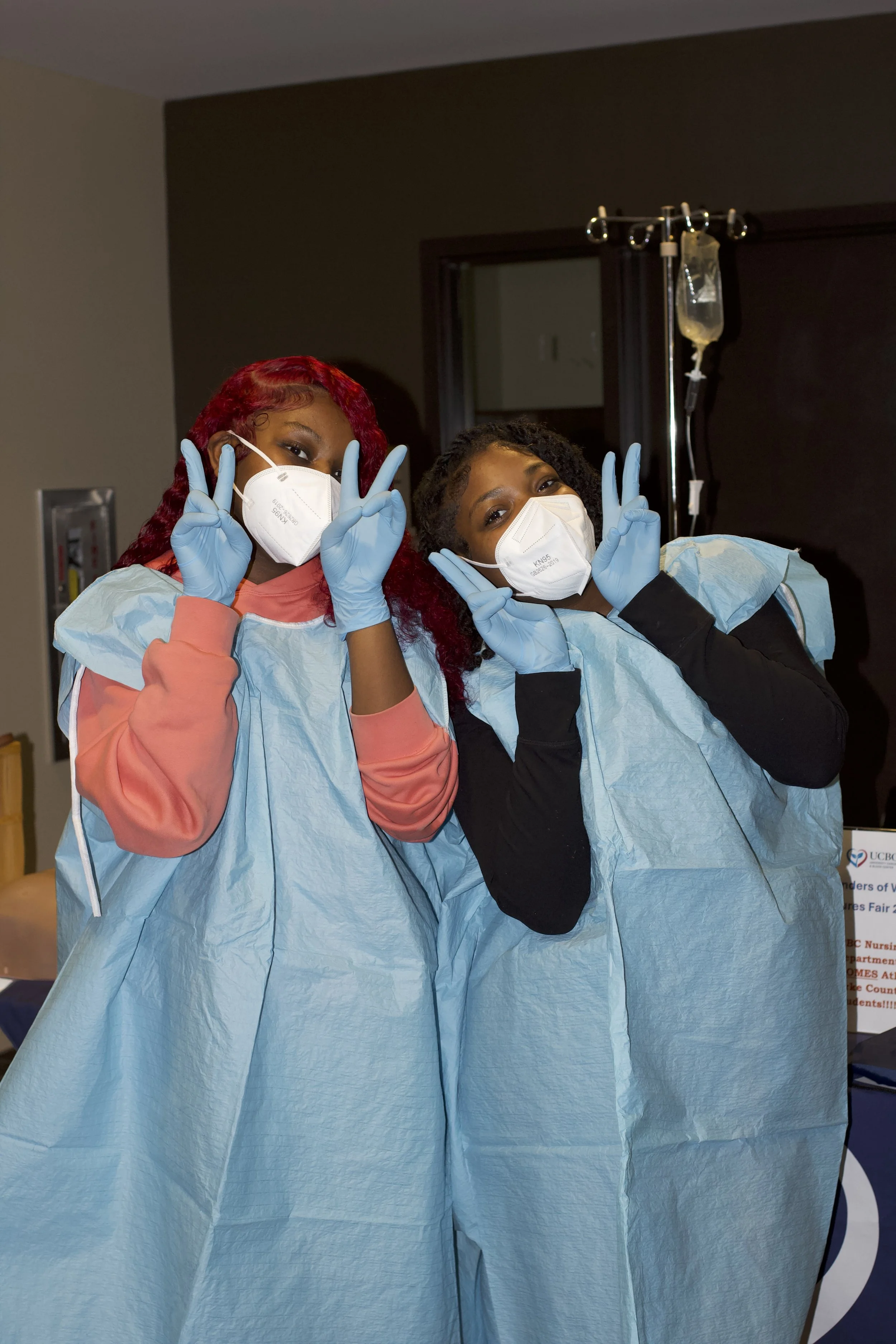
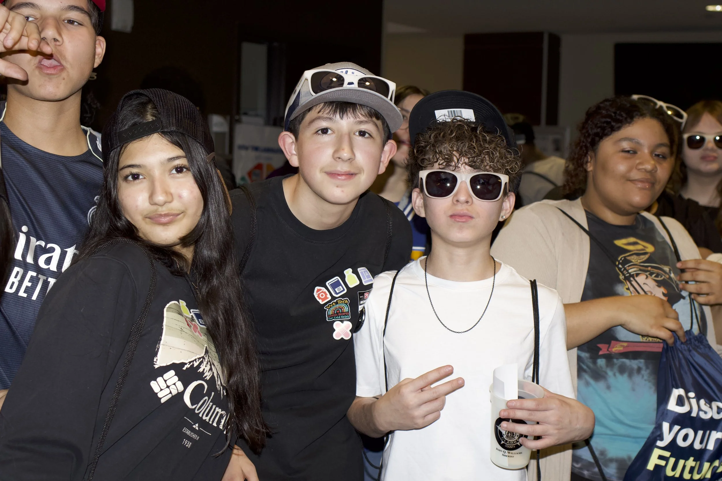
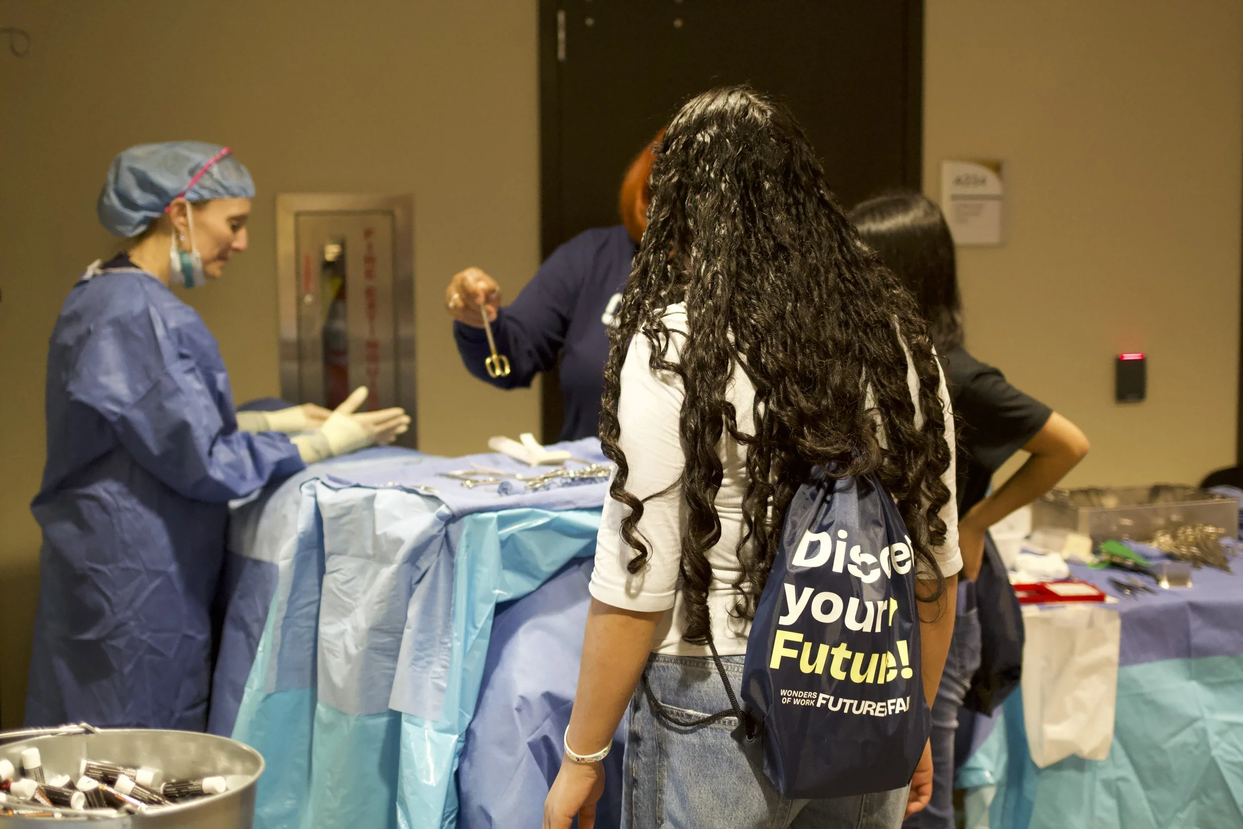
I served as the hands-on photographer for the event, capturing key moments throughout the day. My role involved documenting student interactions with employers, career exploration activities, and the overall energy of the fair. By taking both candid and posed photos, I helped create a visual record that highlights the impact of the event and supports future promotion and outreach efforts.